DINU'S
Since 1982,
without looking like 1982.
- Industry
Print shop
- Location
Osasco, Brazil
- Year
2026
- Scope
Visual identity
The challenge
In business since 1982, with a brand that seemed to have stopped there.
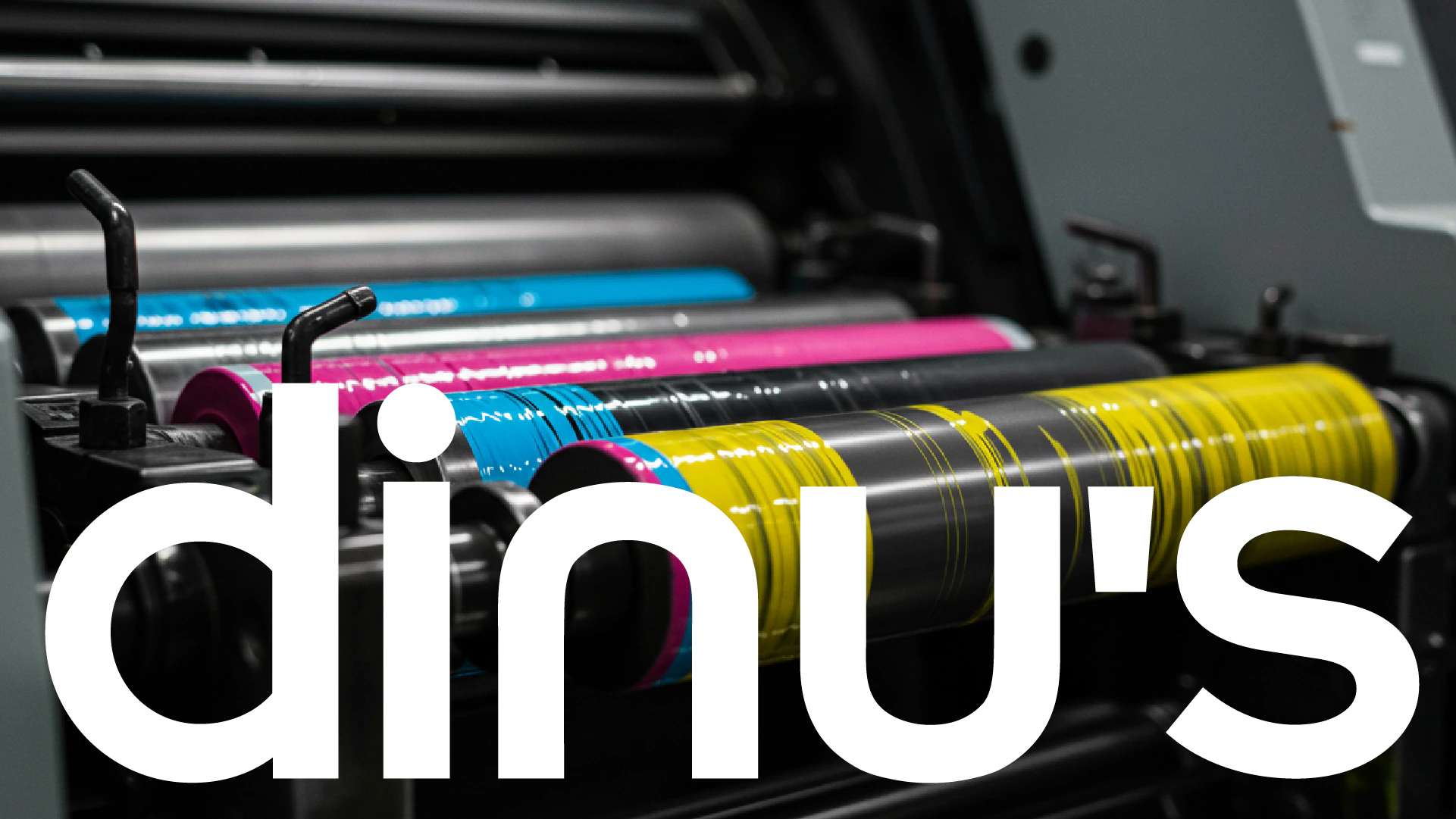
DINU’S is a print shop in Osasco, Brazil, working with offset, digital printing and print management, including storage and logistics. The operation had evolved, but the brand was dated and didn't show the company of today. The challenge was to update it without erasing its history.

The idea
Print-shop precision, tech-company look.
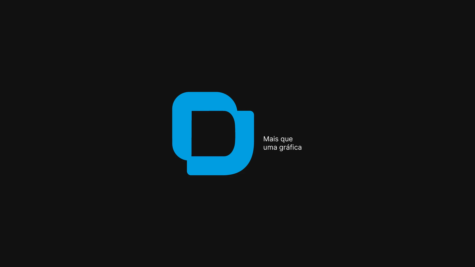
- The symbol.Geometric and minimal, with rounded corners and continuous lines.
- The typeface.Sans serif, strong and geometric.
- The colors.Neutrals (deep black, warm white and grays) with a cyan blue as a tech accent.

The applications
From print to digital.
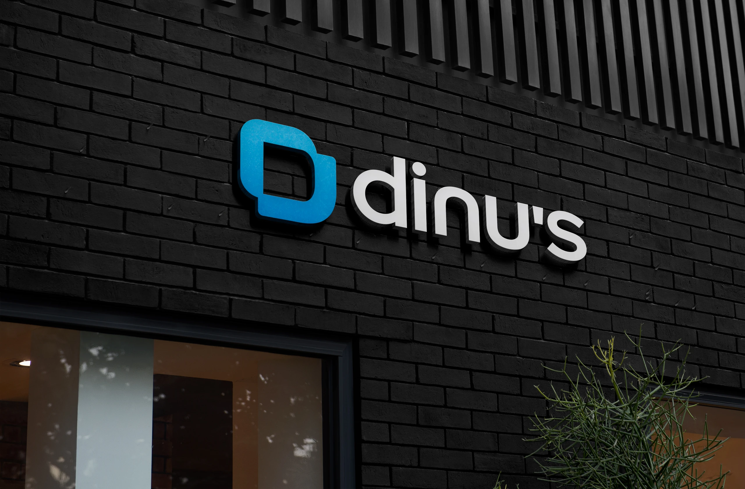
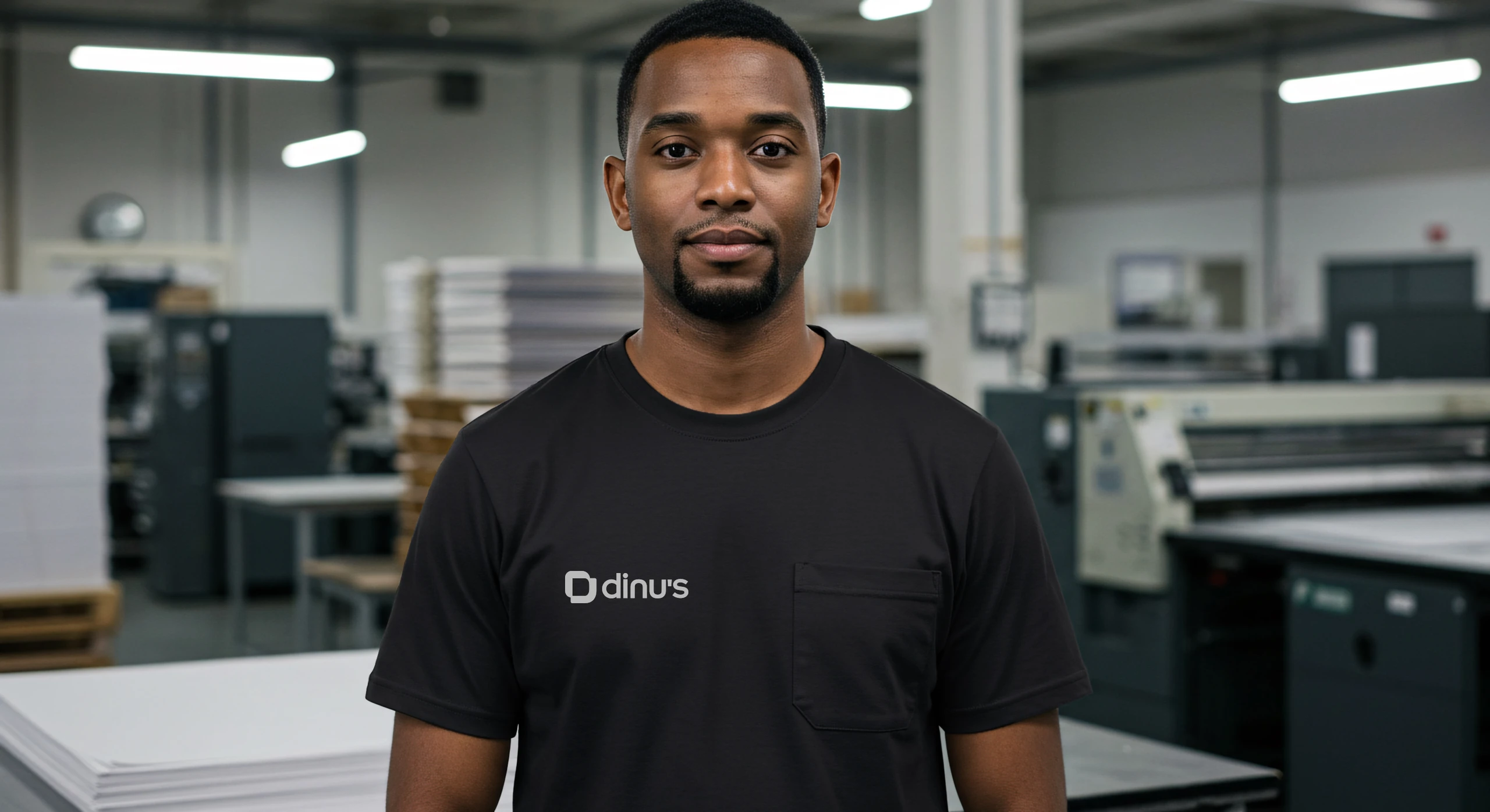
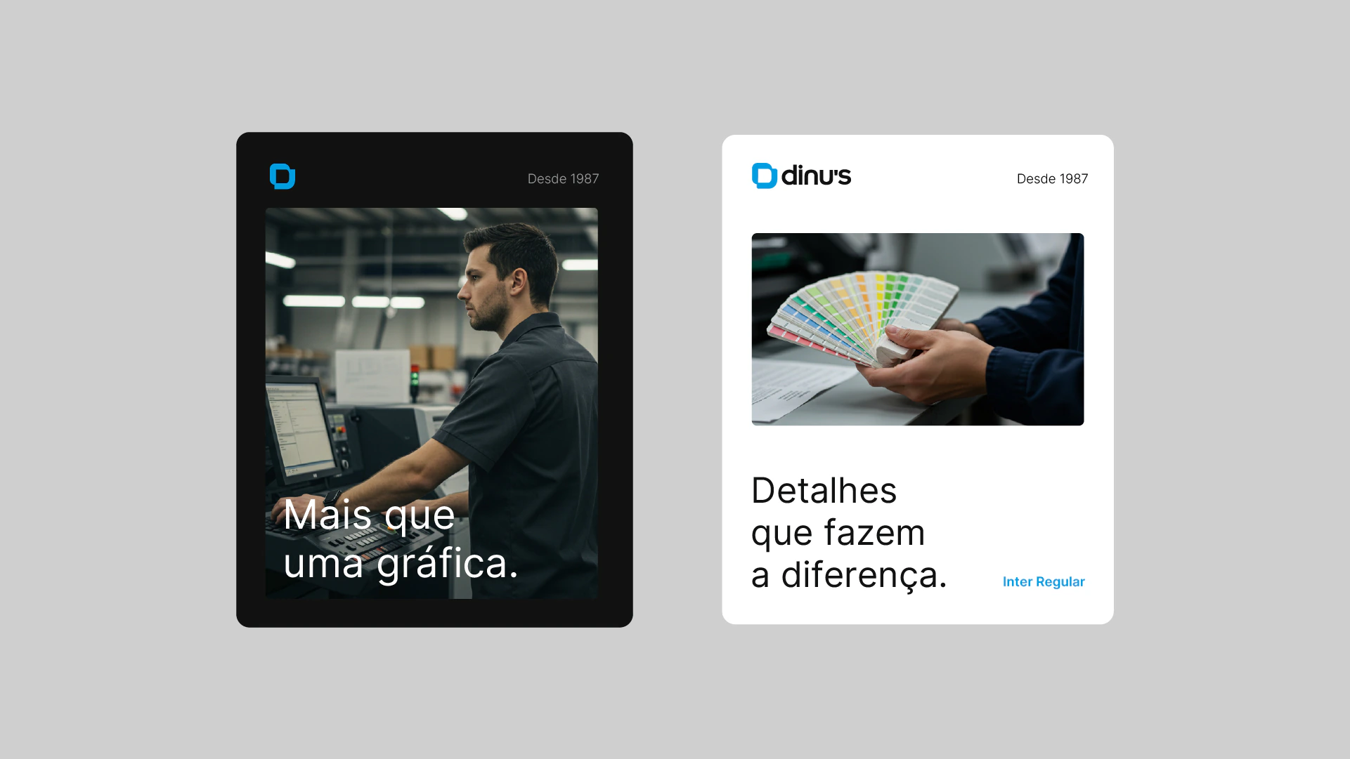
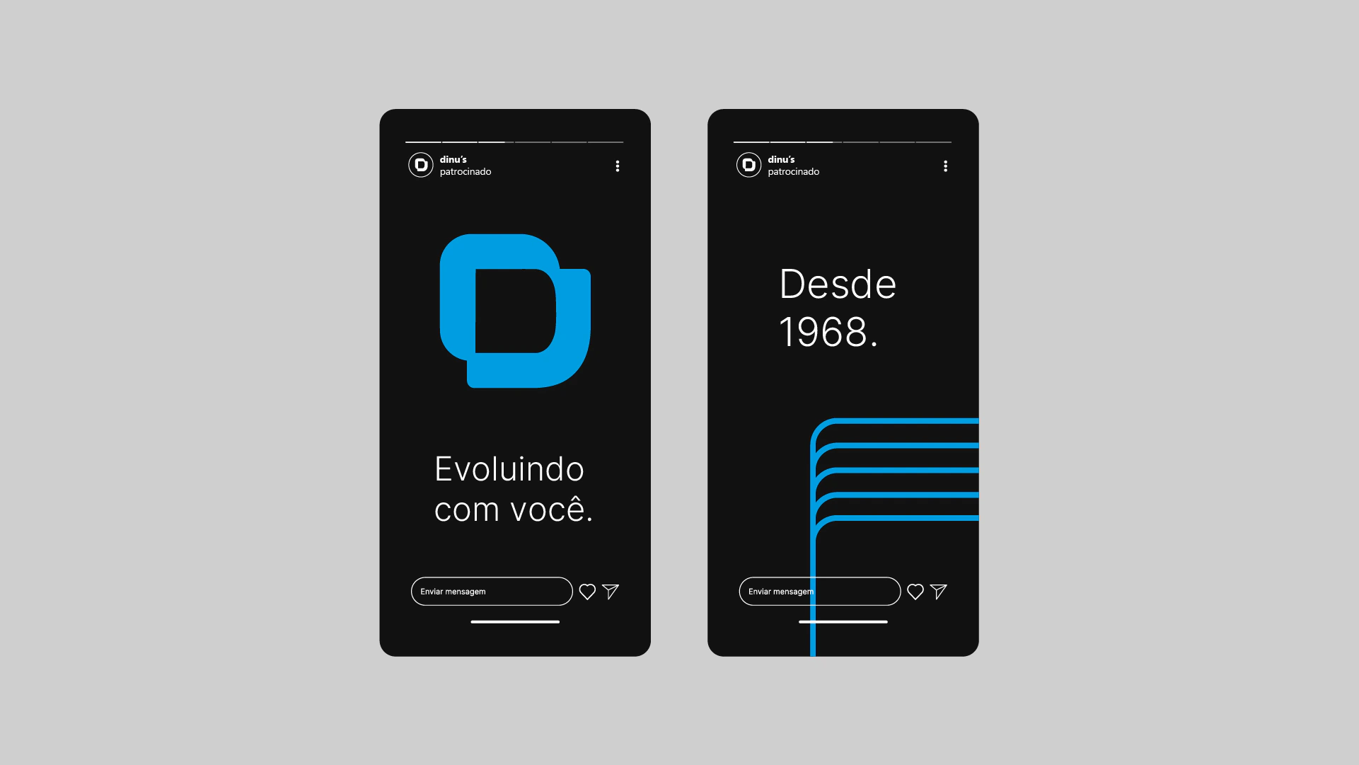
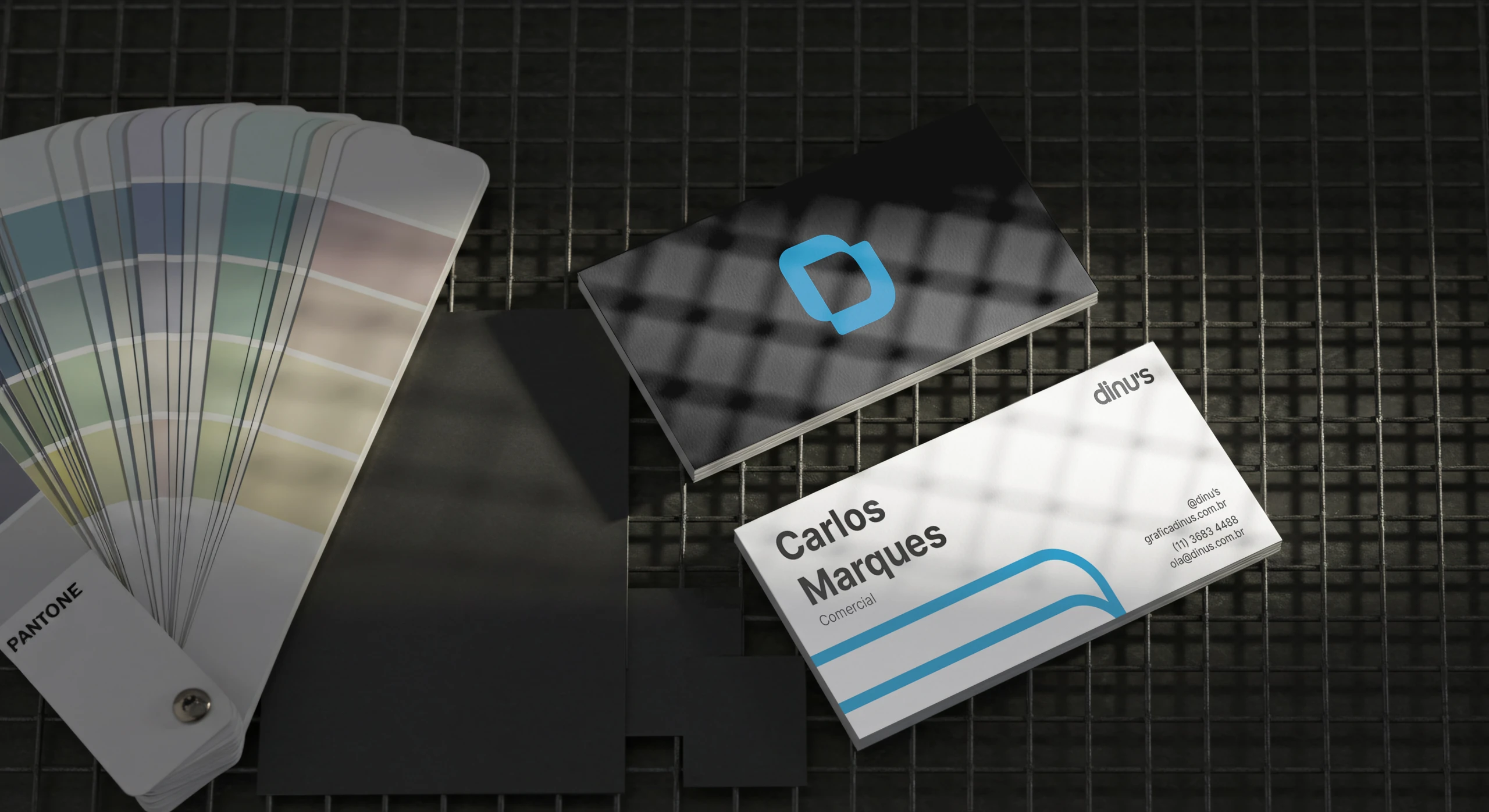
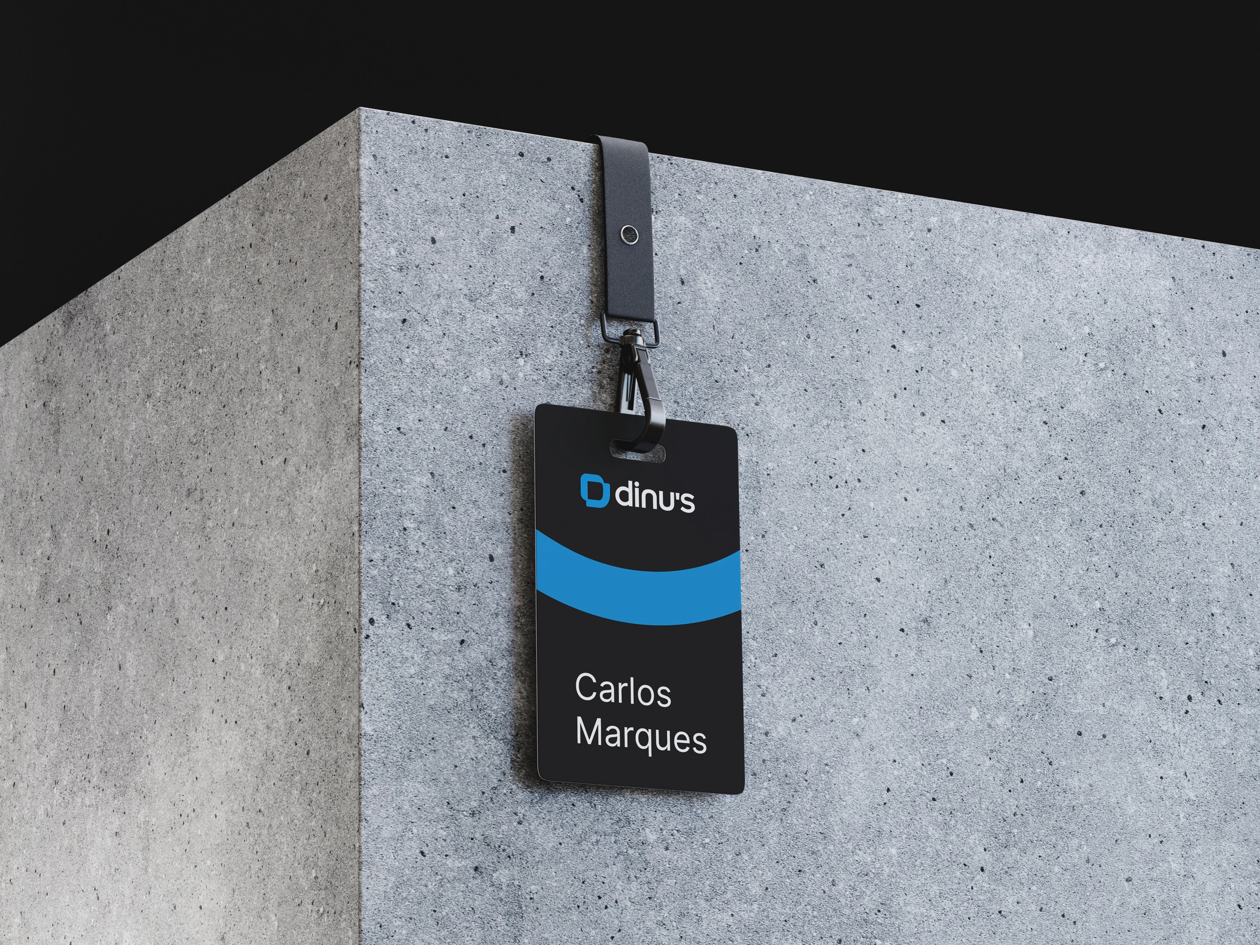
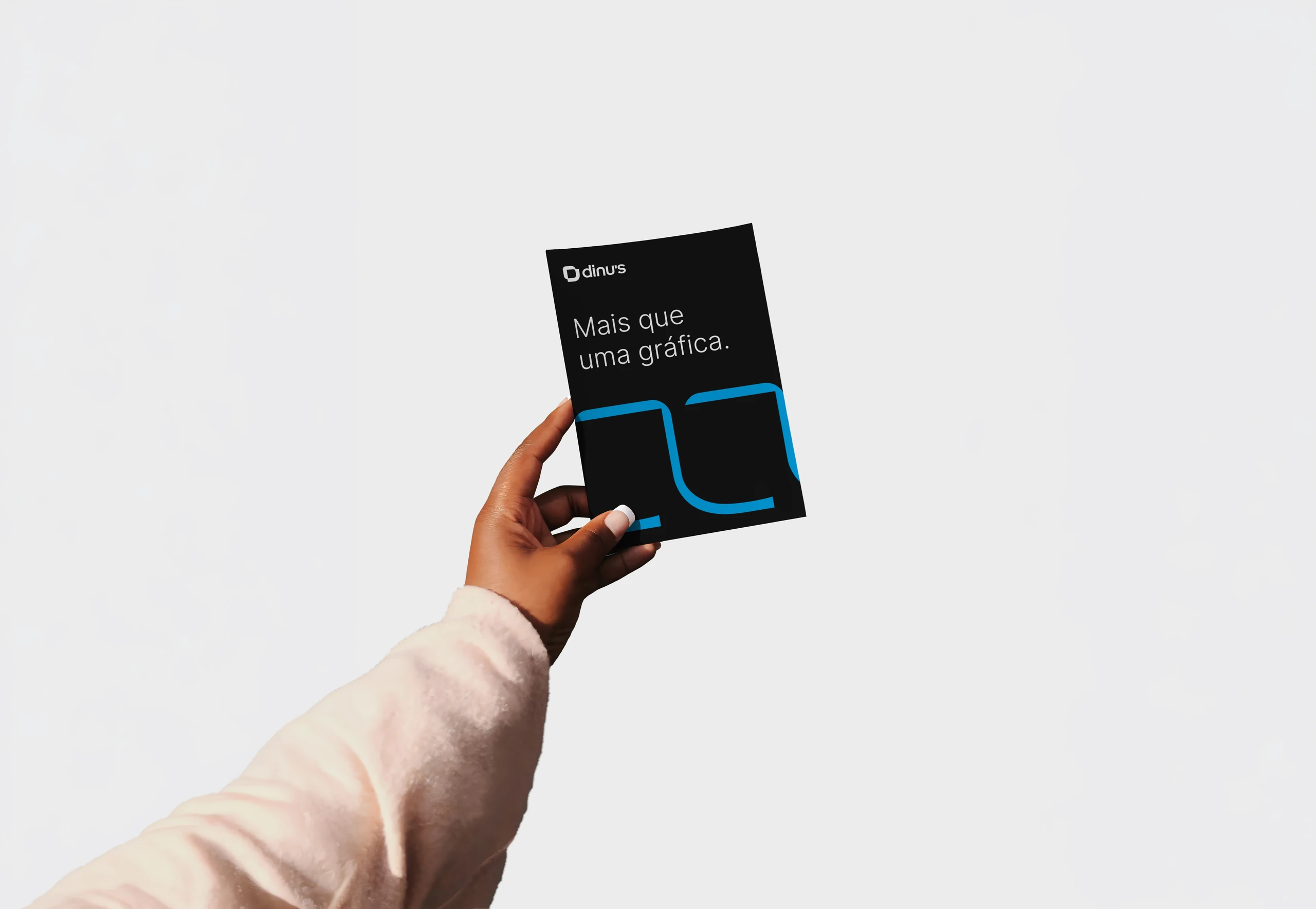
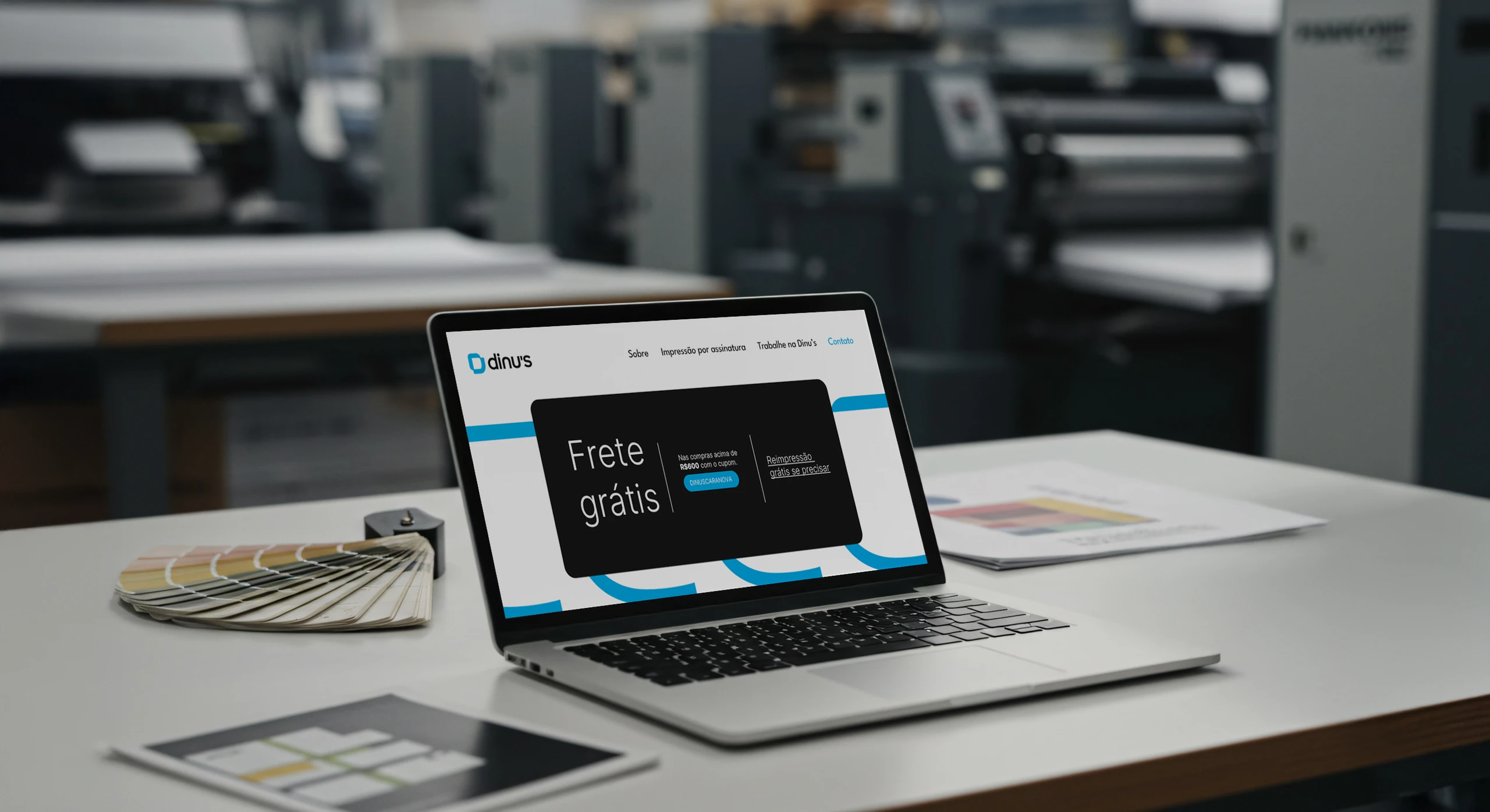
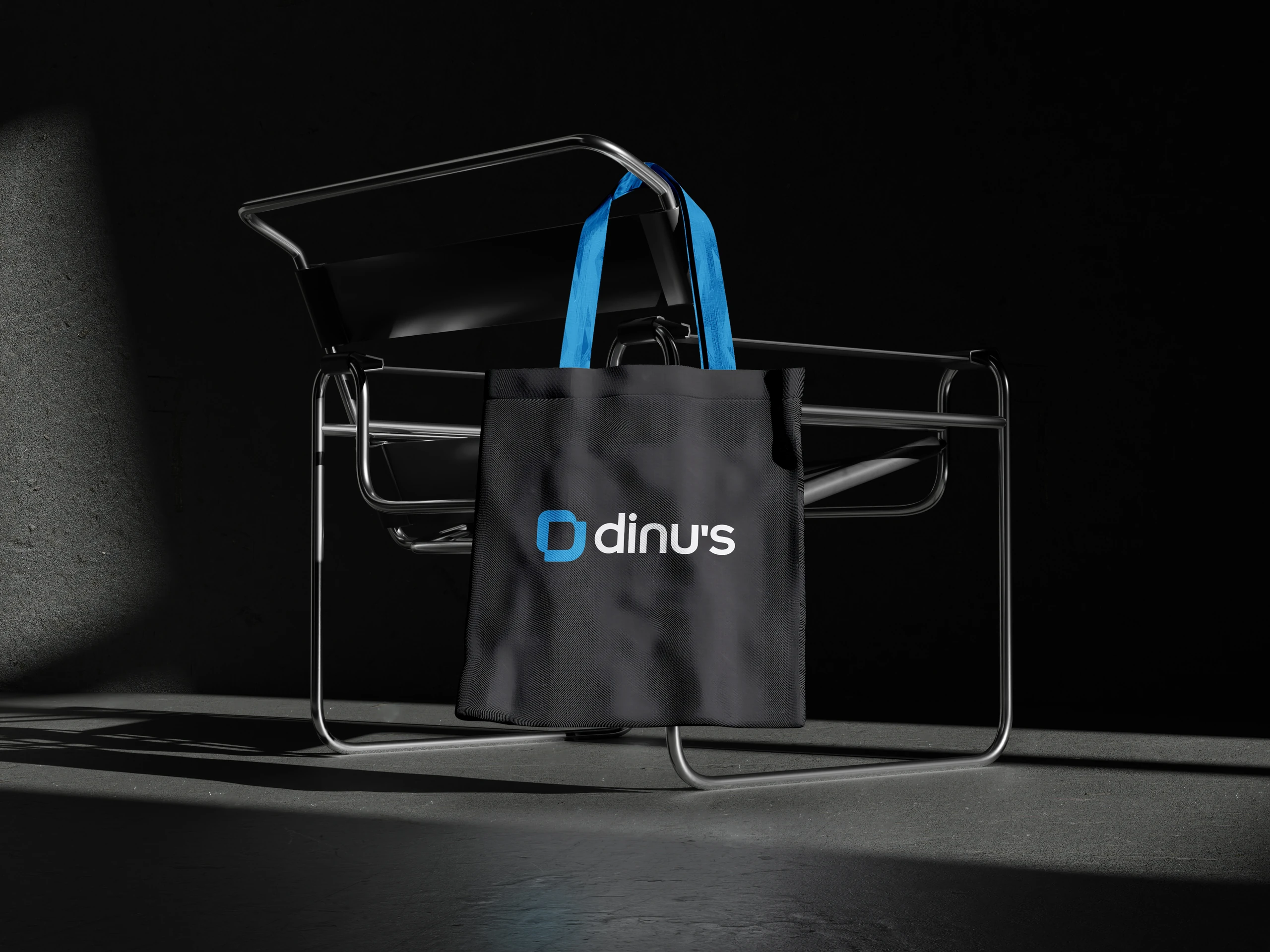
The identity was designed to work on paper and on screen: from the fleet and the production floor to the website and social media.


Does your brand show the company you are today, or the one you were when you started?
 Next projectMegah
Shall we take
a look at
your brand?
The review is a free online conversation. We'll get in touch within 1 business day.