Estevan Hara
Less property.
More listening.
- Industry
Real estate consulting
- Location
Santos, Brazil
- Year
2026
- Scope
Visual identity and photography direction

The challenge
House, key and roof: the whole industry speaks the same visual language.
Estevan Hara is an independent real estate consultant in Santos, Brazil, with hand-picked homes near the beach, from upper-mid to high end. The brand needed to break the stereotype of the pushy broker and show a partner instead: a simple, transparent and safe journey, at the buyer's own pace.

The idea
Talk about listening, not about property.
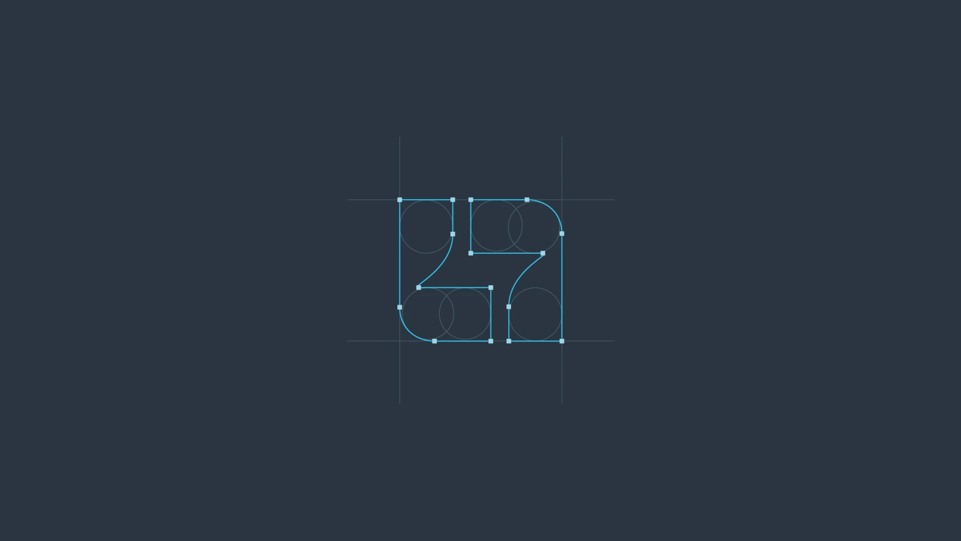
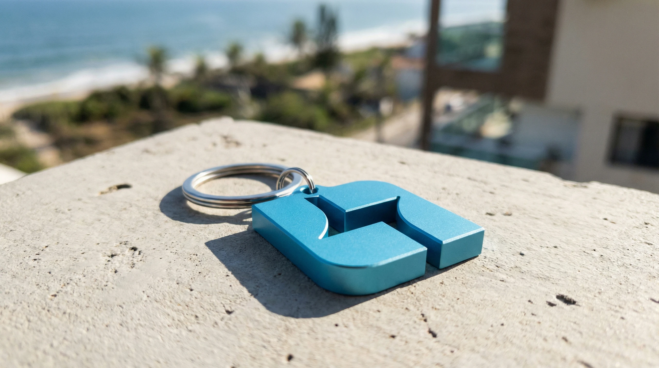
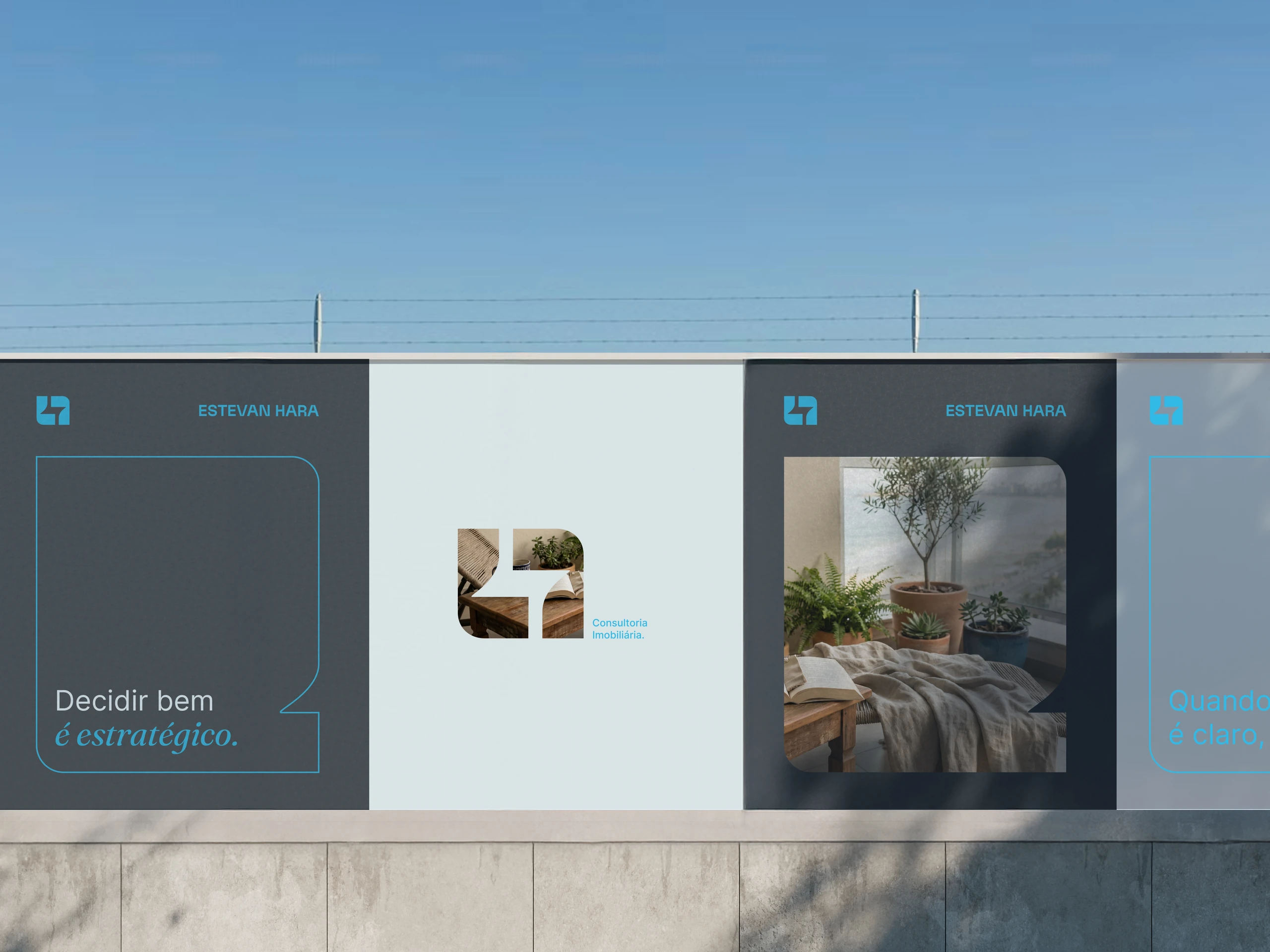
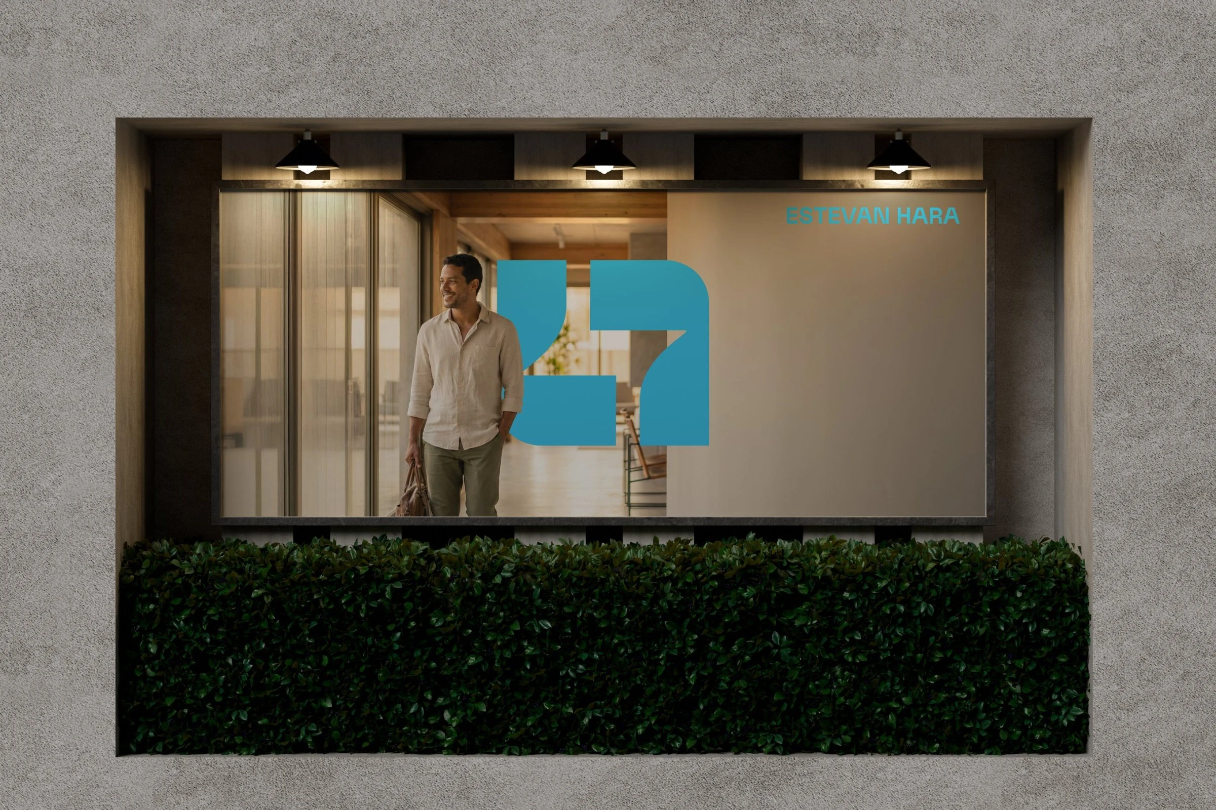
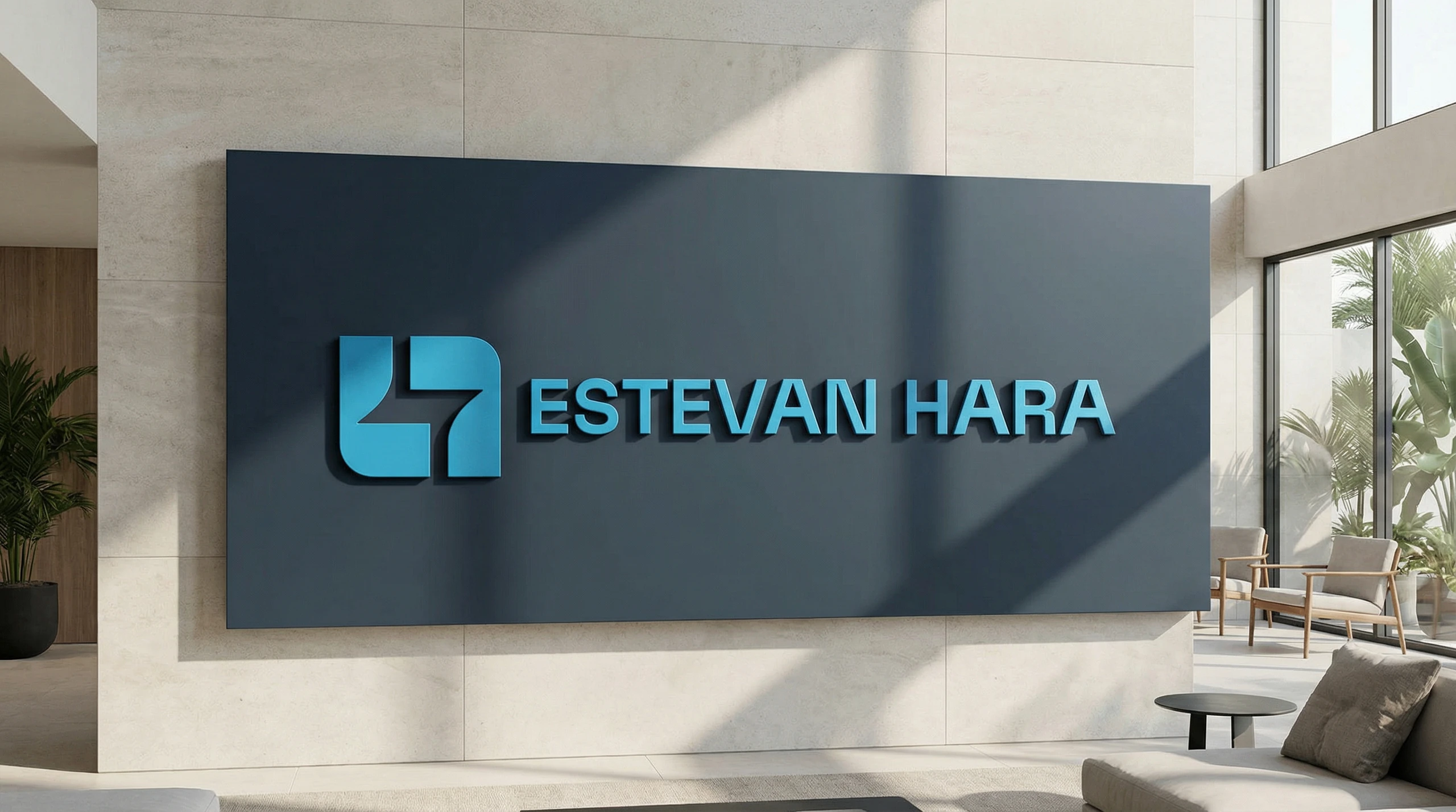
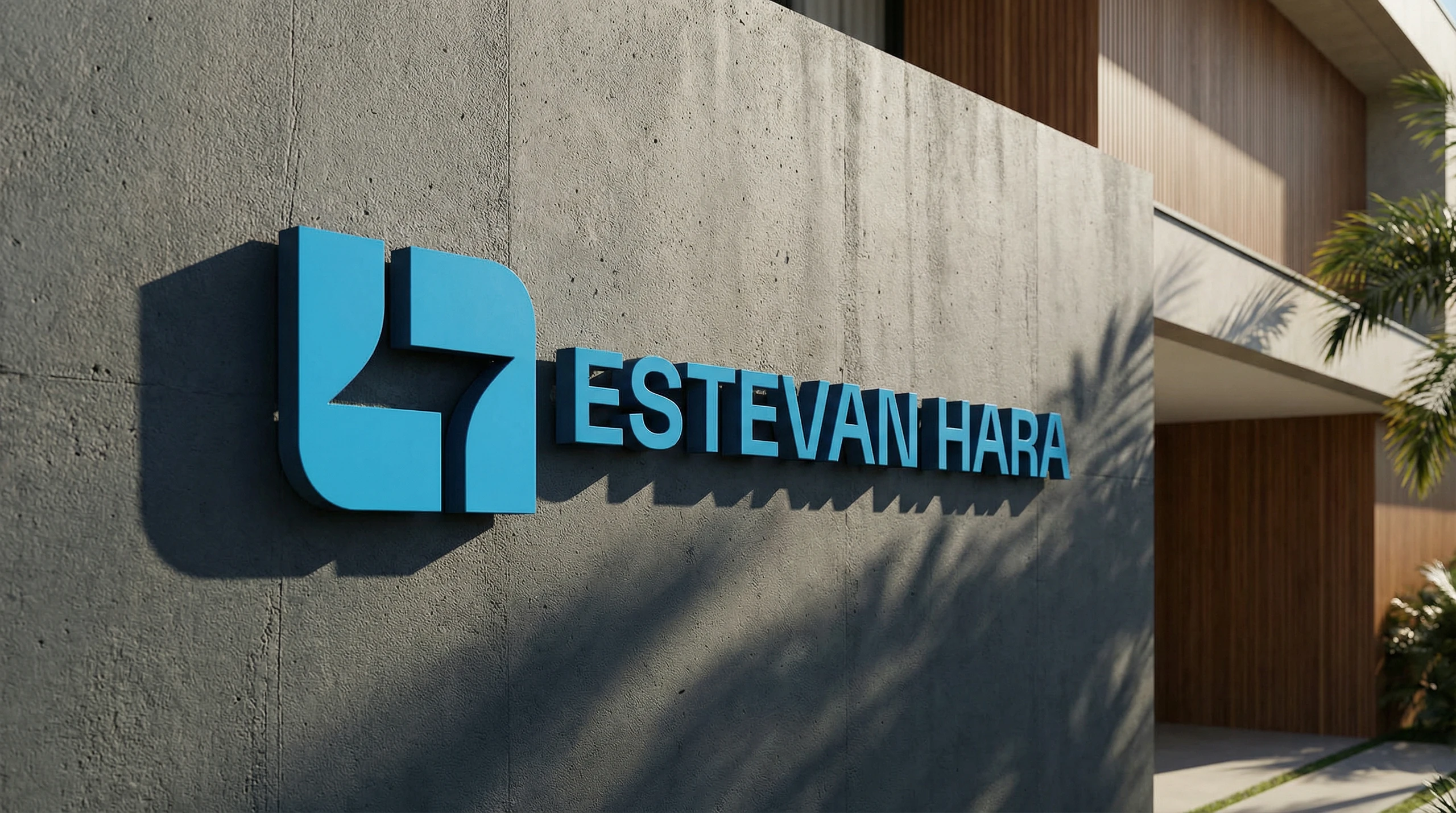
No houses, roofs, keys or buildings. The symbol comes from the name itself: solid geometric shapes that read as an H. Behind it, subtle nods to Japanese culture: harmony, care and perseverance.

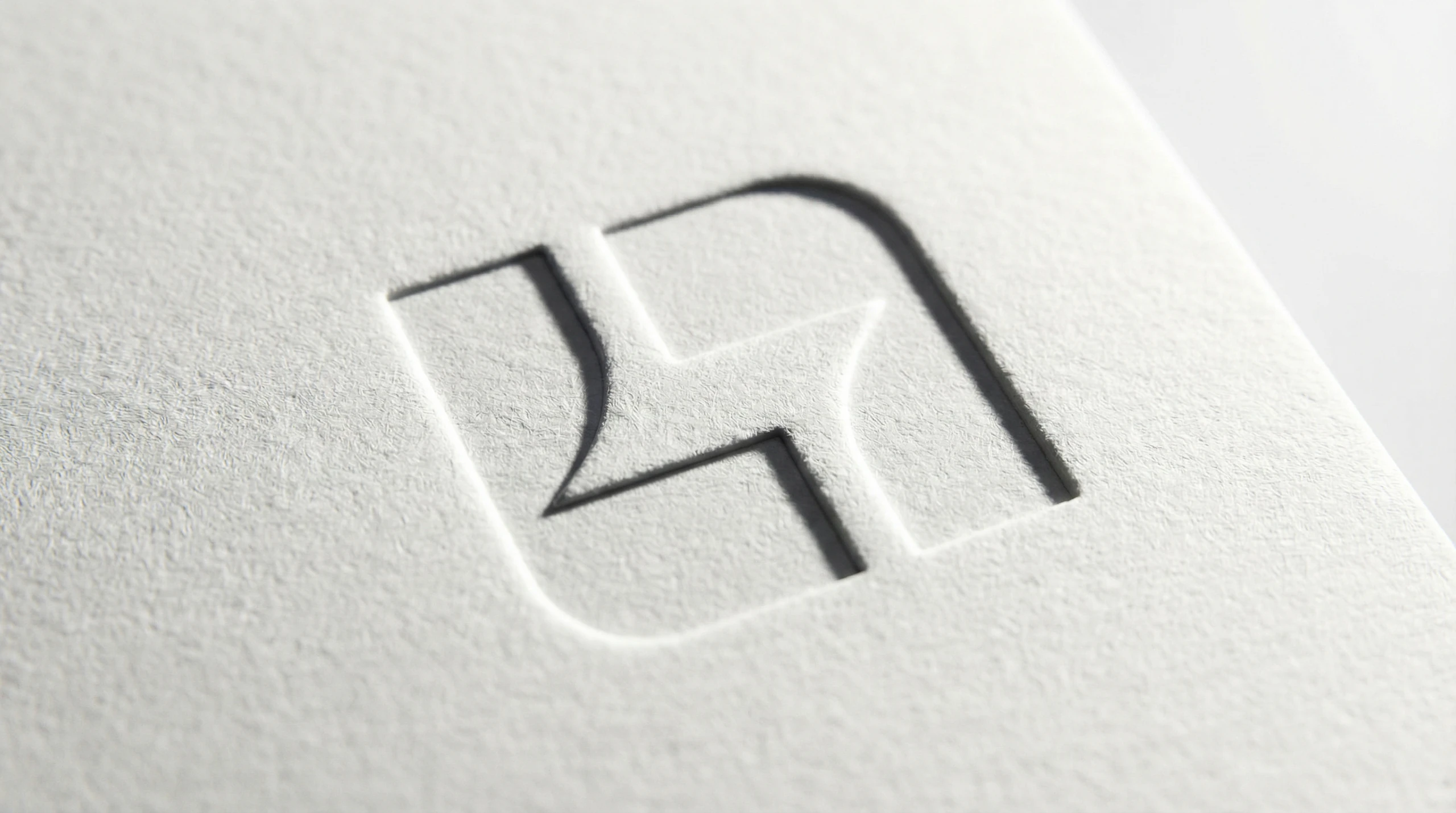
The identity
Calm, clarity and natural light.
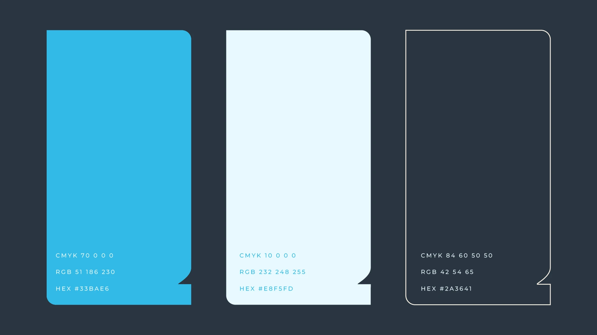
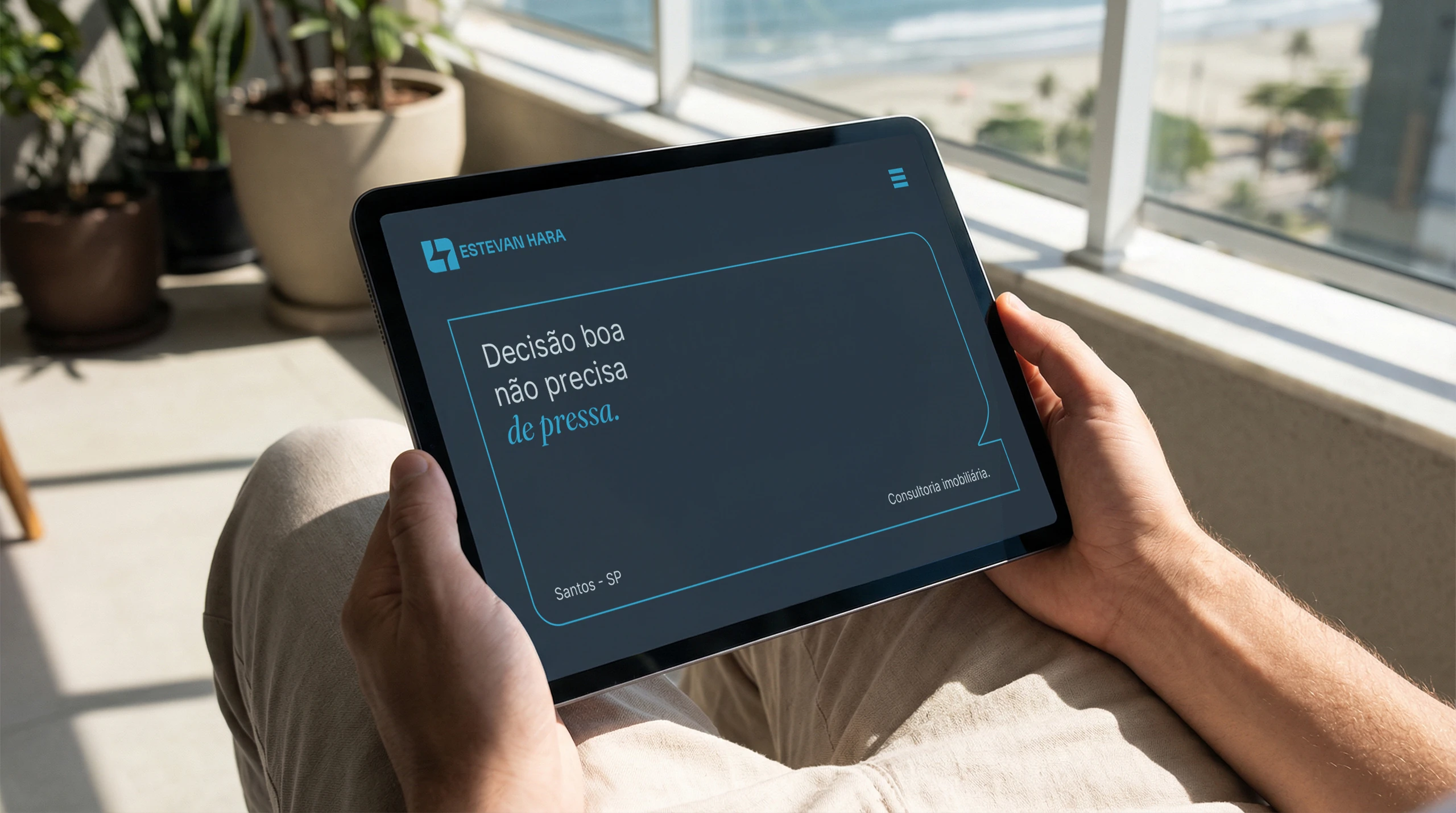
- The colors.An accent blue, a deep blue and neutrals. Trust without coldness.
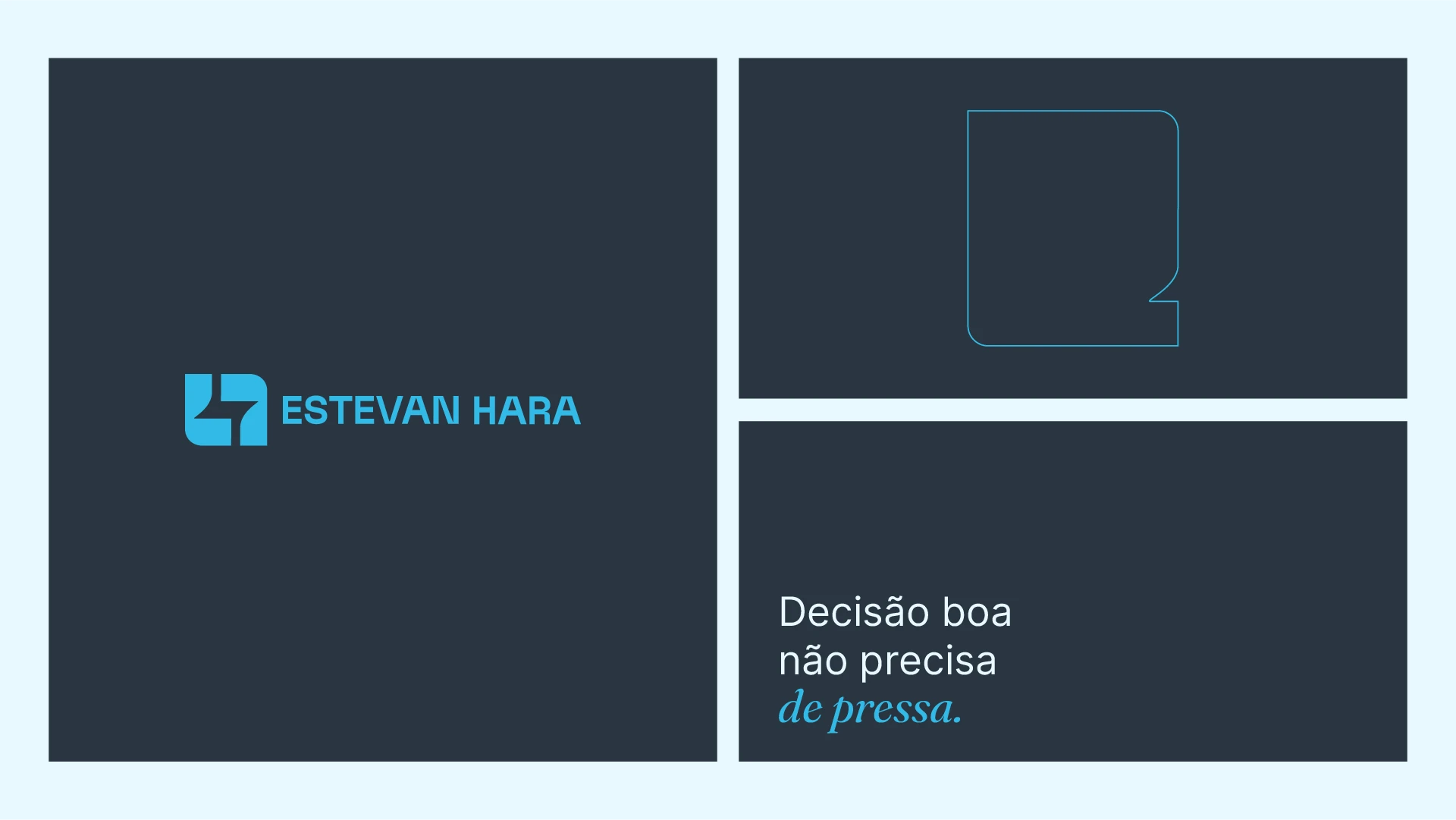
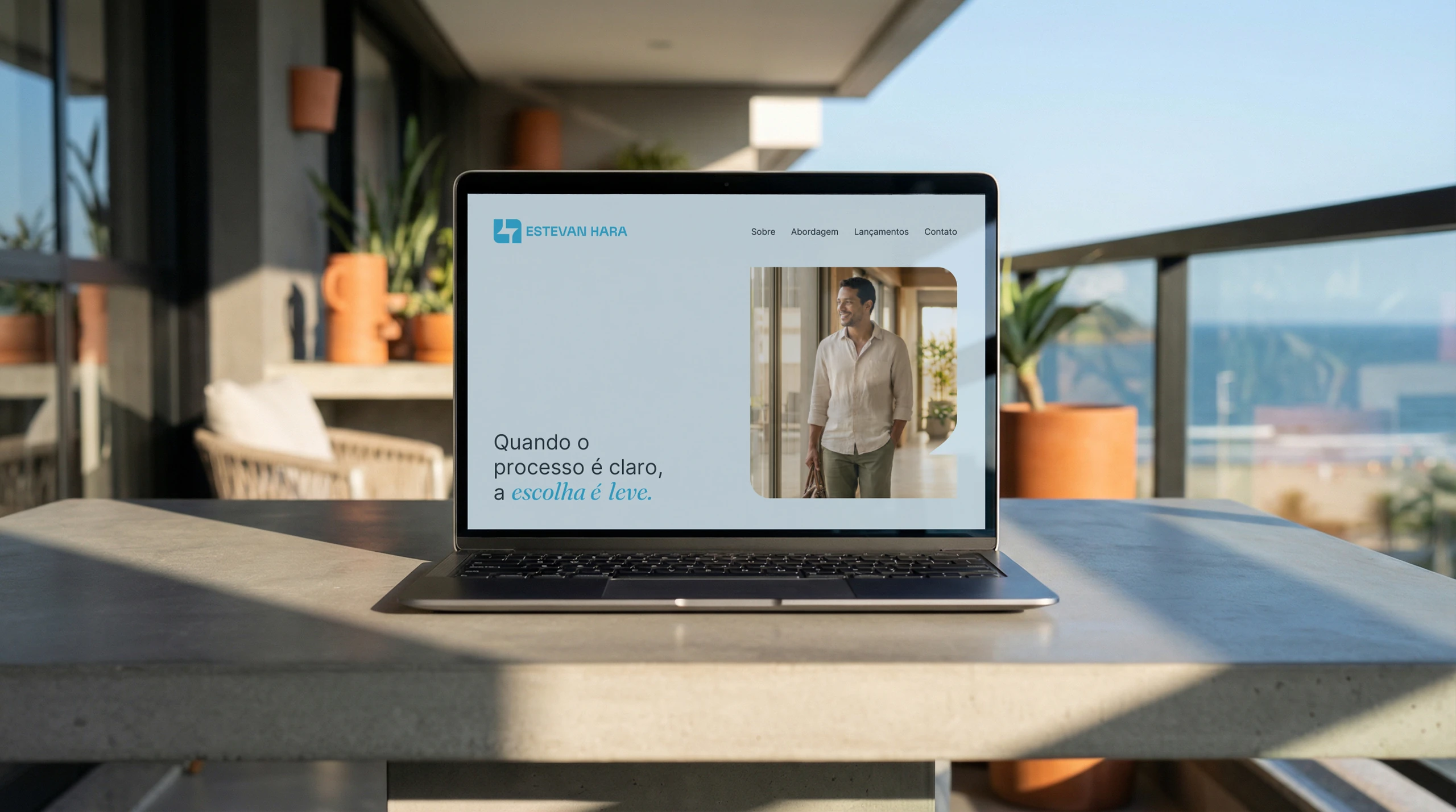
- The typefaces.Inter for text and Francues for headlines: clean reading with a signature touch.
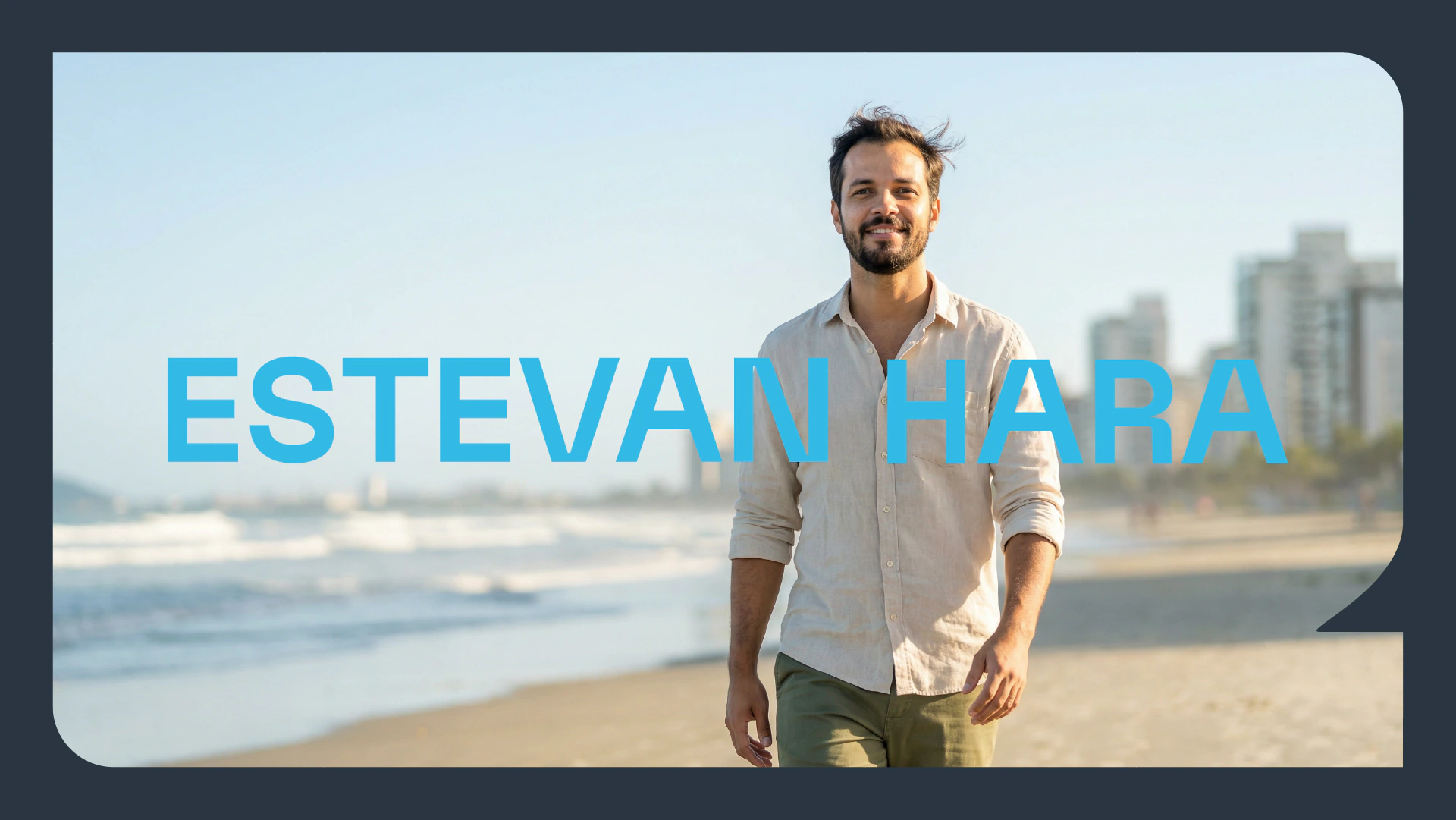
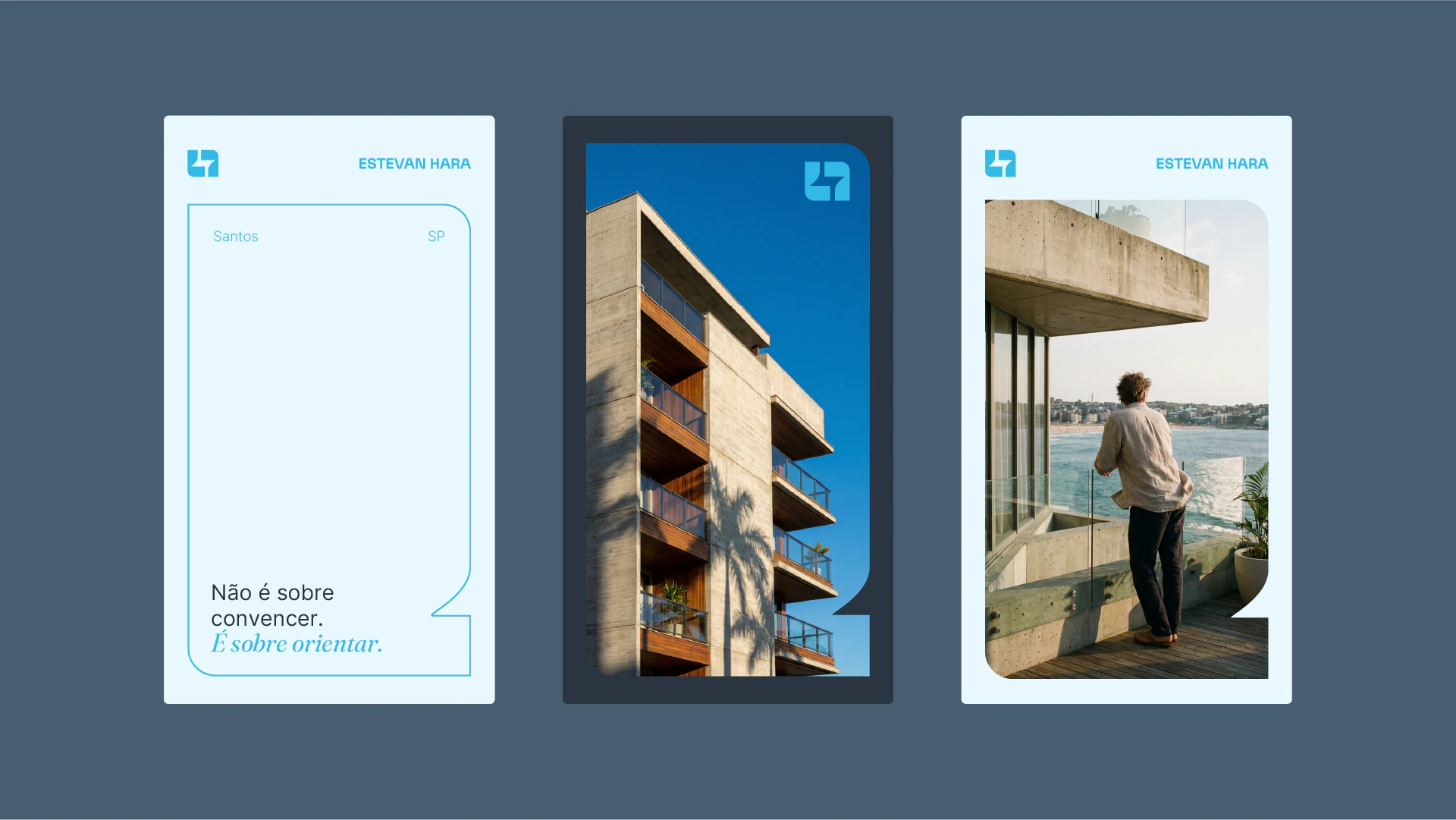
- The photography.Natural light, architecture, real materials and a subtle human presence. The property is there, but the person is at the center.
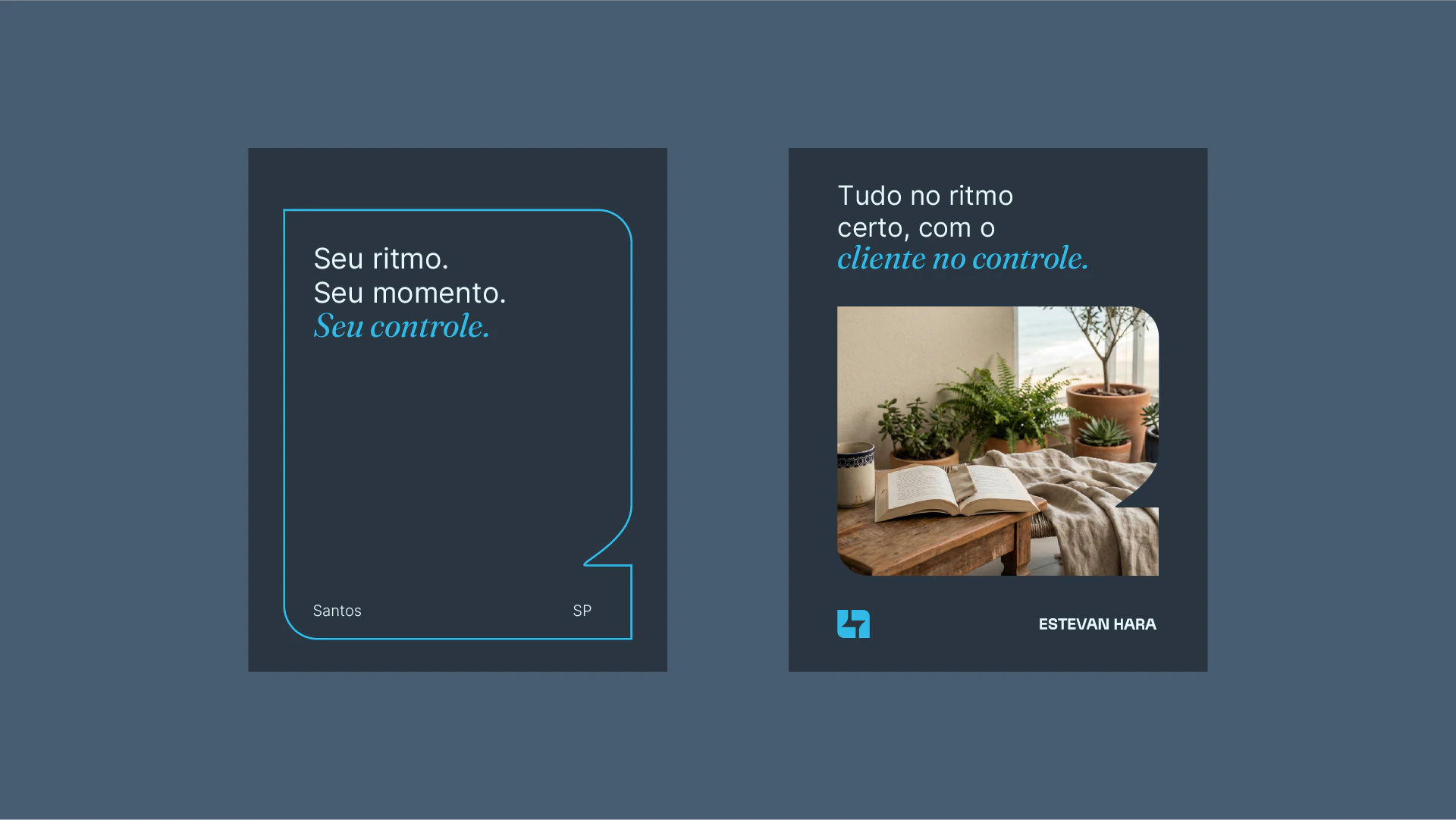
The pieces all speak in the same tone:
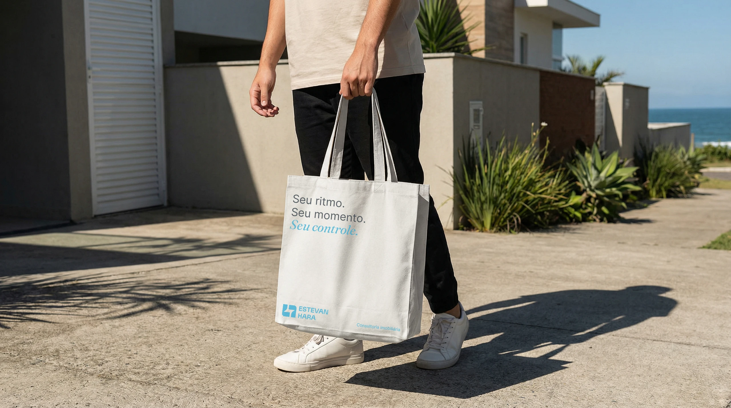
“Seu ritmo. Seu momento. Seu controle.” (Your pace. Your moment. Your call.)
“Decisão boa não precisa de pressa.” (A good decision doesn't need to be rushed.)
“Quando o processo é claro, a escolha é leve.” (When the process is clear, the choice feels light.)





The applications
From the welcome box to the beach umbrella.
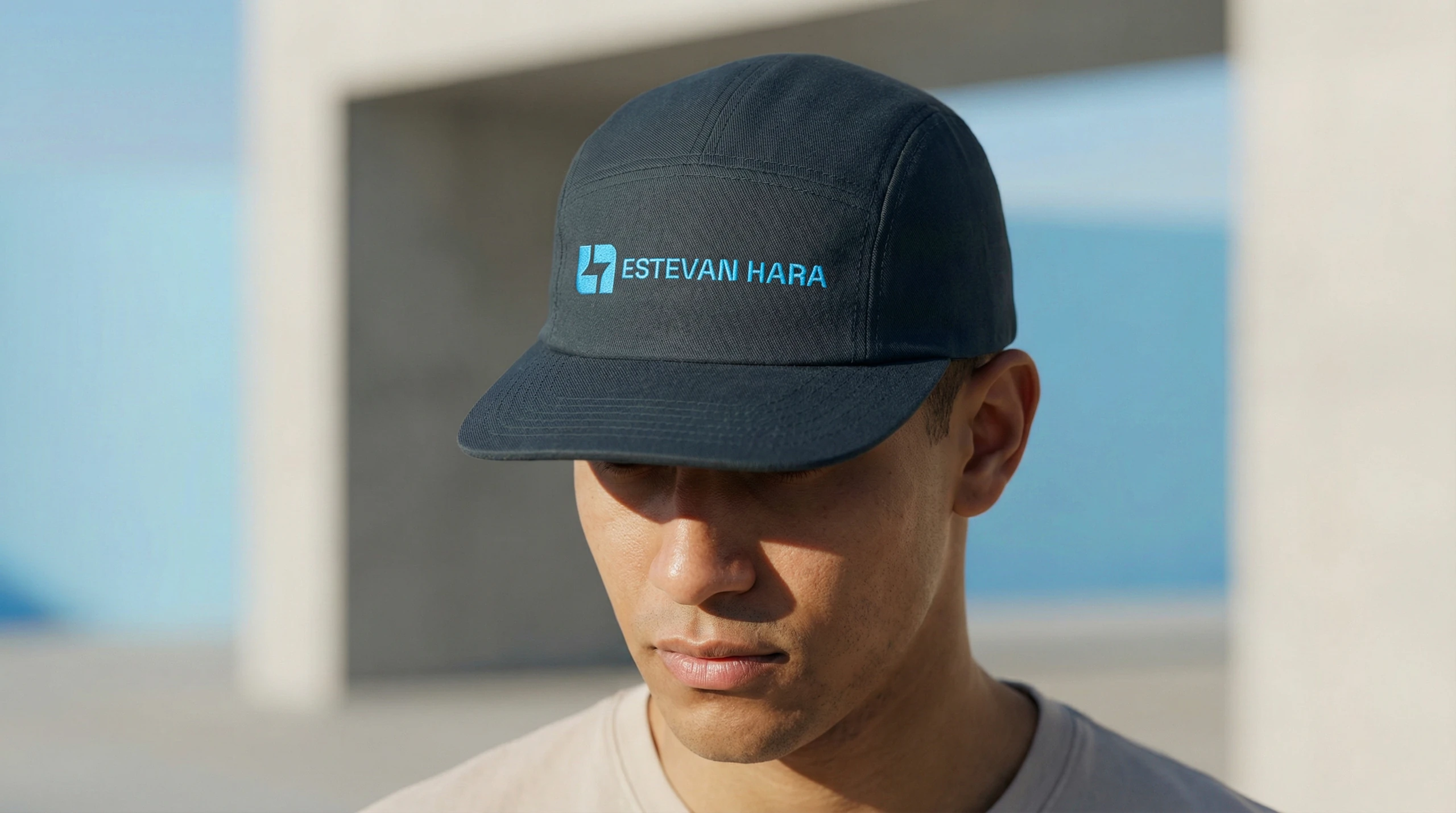
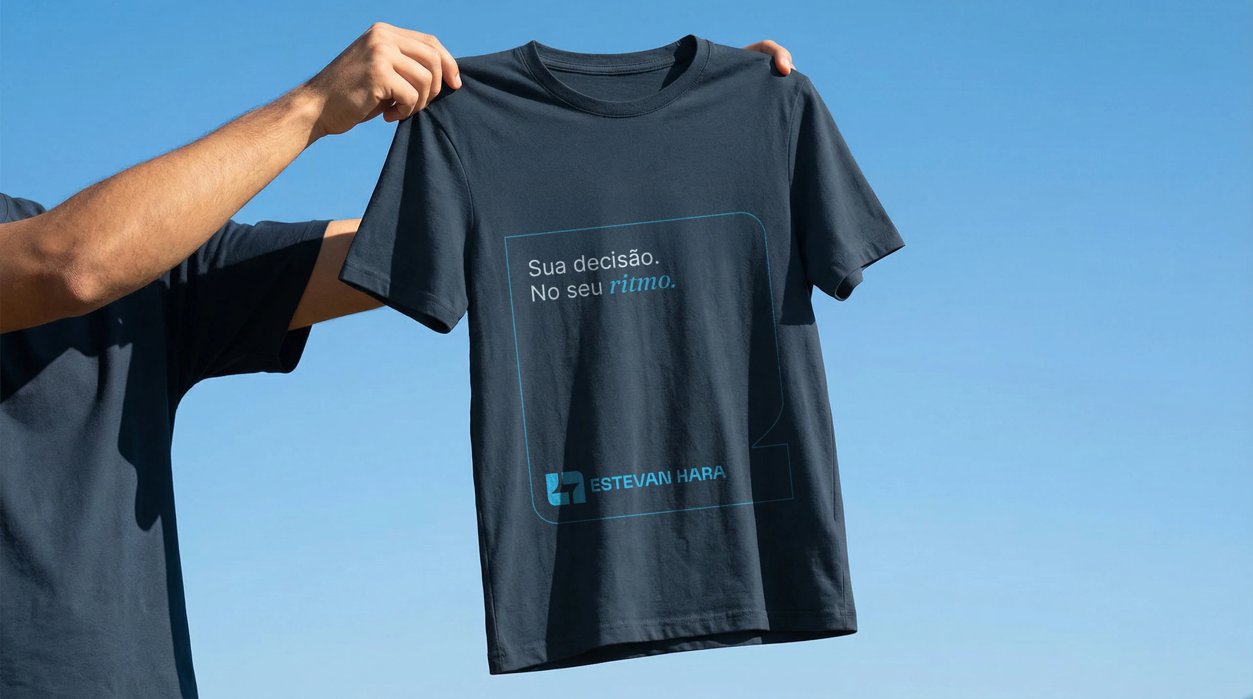
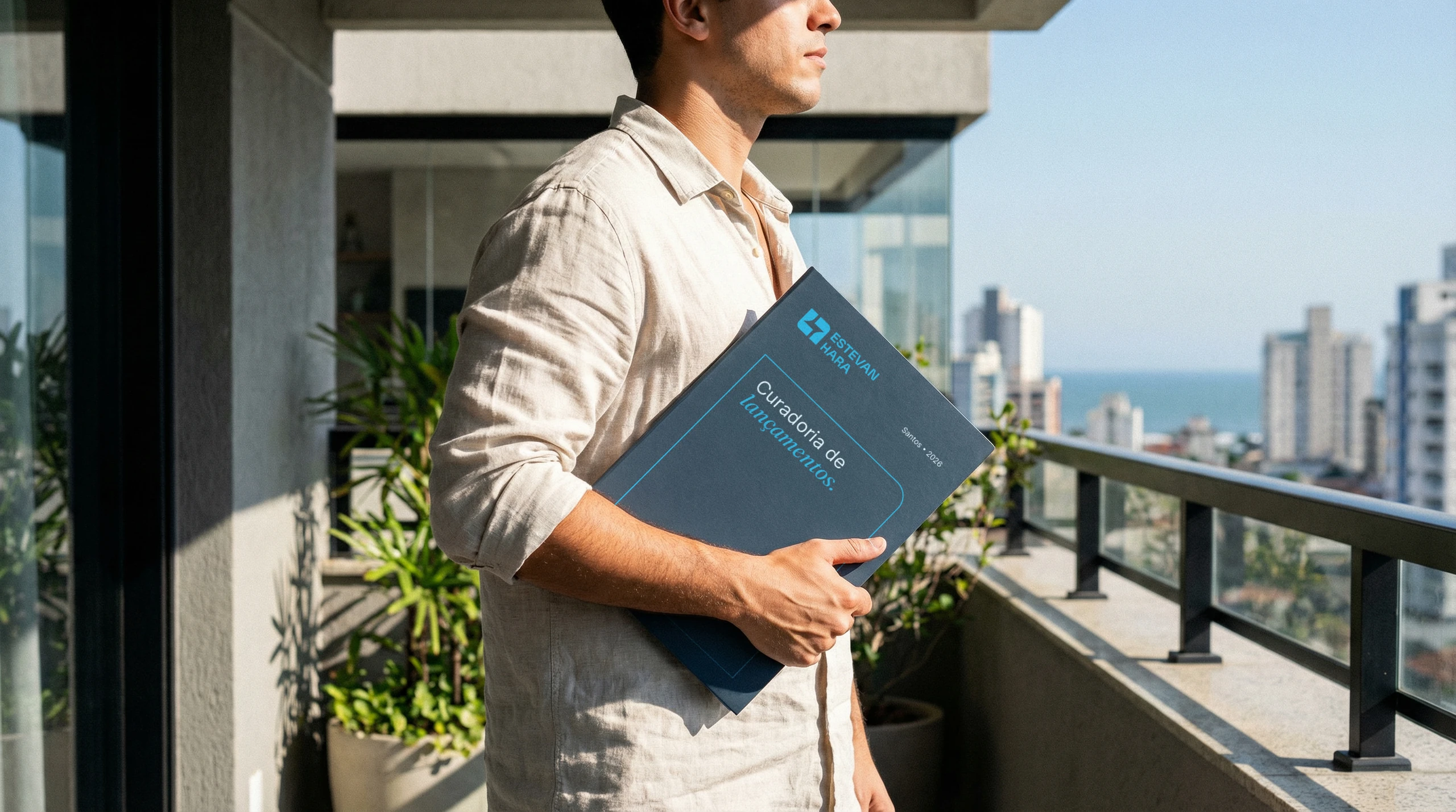
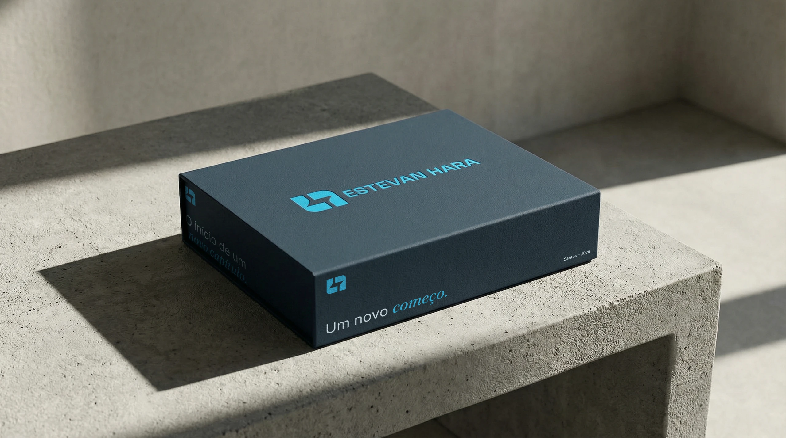
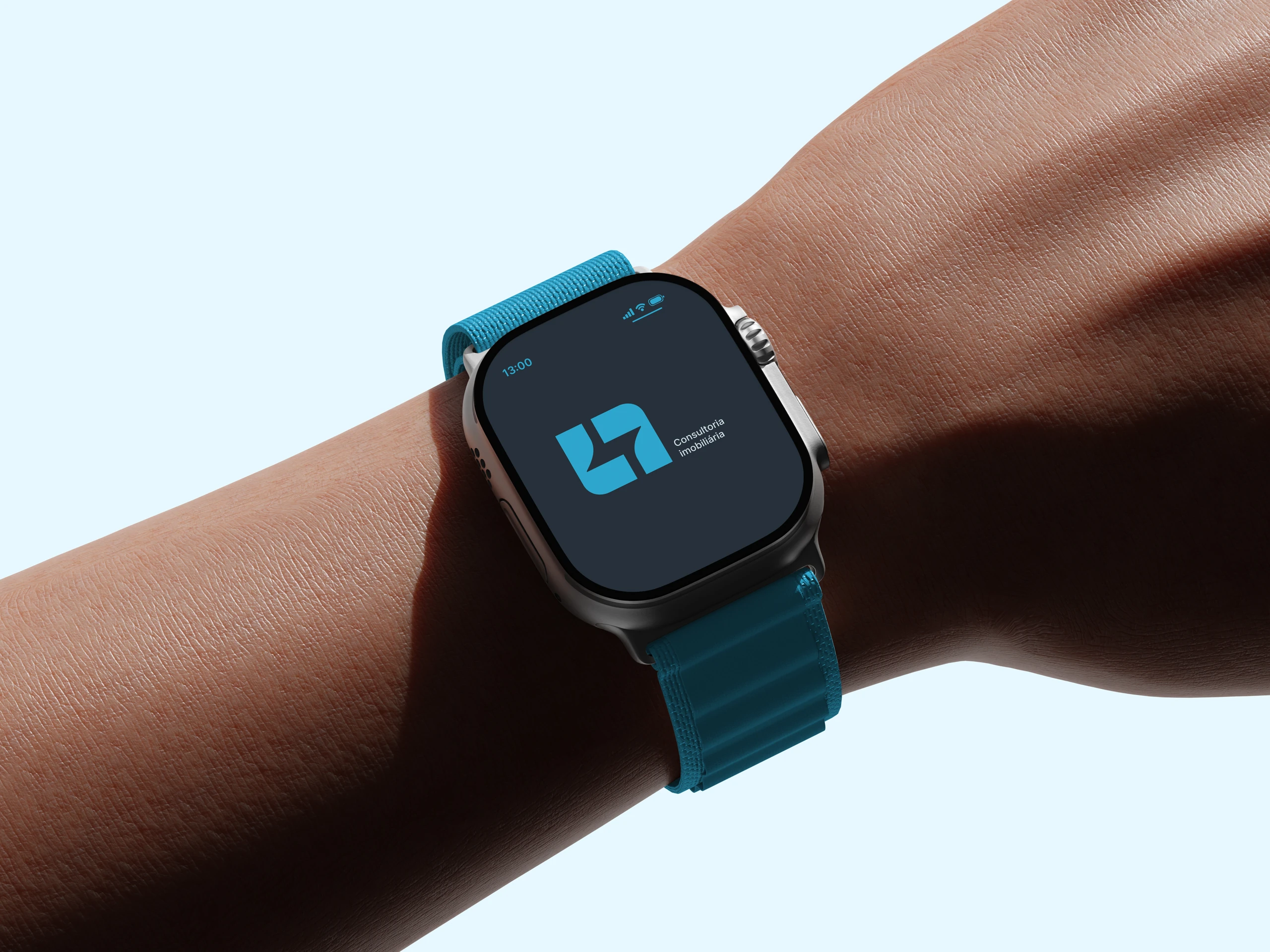
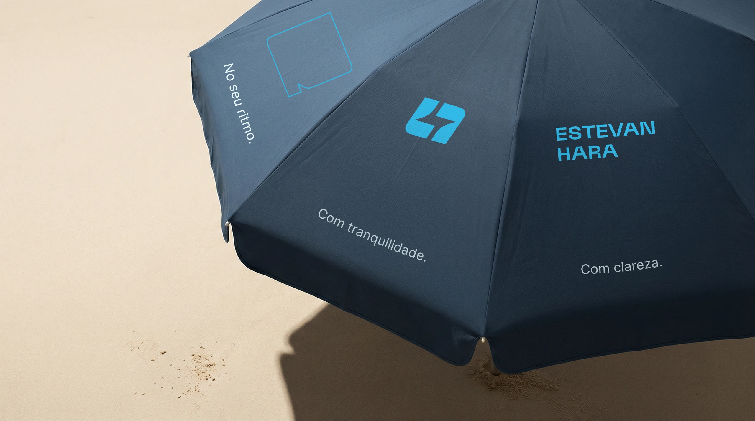
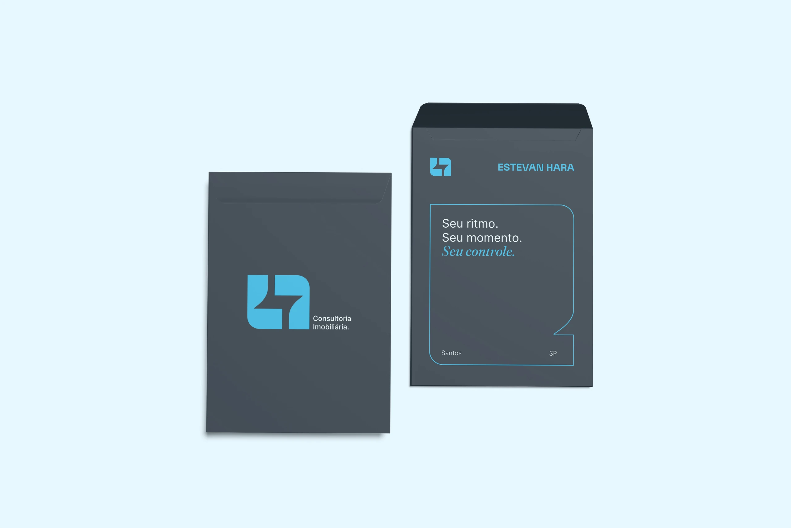
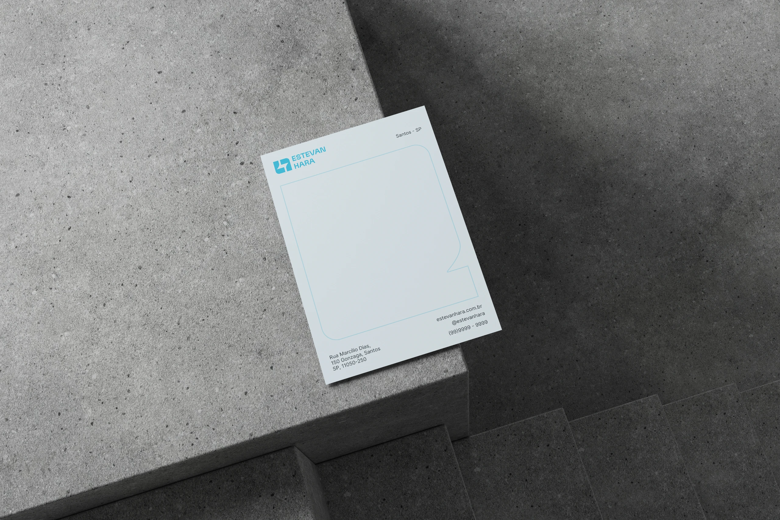
The identity is already live on social media. The system was also designed for stationery, a new-listings folder, T-shirt, cap, tote bag, welcome box, beach umbrella and website.


Does your brand talk about what you sell, or about how you look after the people who buy?
 Next projectDiamantino
Shall we take
a look at
your brand?
The review is a free online conversation. We'll get in touch within 1 business day.