Tia Pri
The snacks were already good.
The brand was missing.
- Industry
Savory snack factory
- Location
Teófilo Otoni, Brazil
- Year
2026
- Scope
Visual identity and verbal identity
The challenge
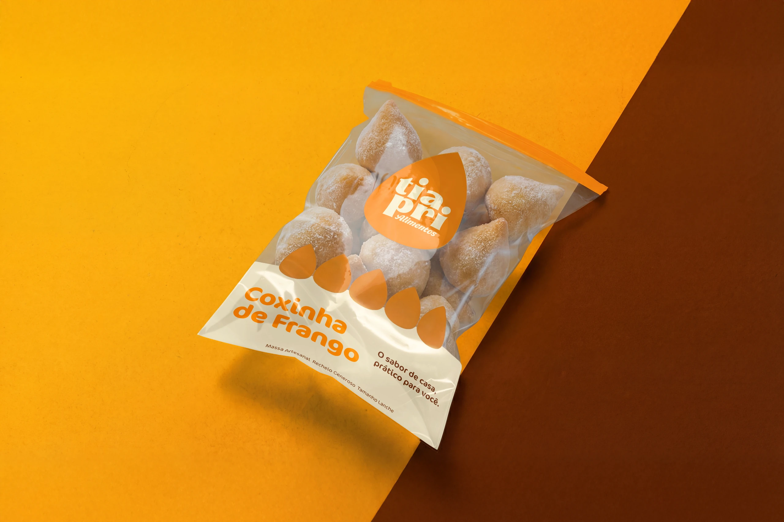
The factory had years of well-made snacks, but no name of its own. On the packaging, just a plain white label.
It started about 10 years ago to supply the owners' snack bar, and today it sells to other snack bars in town and to bus stops across the region. Without a brand, it was seen as part of the snack bar. The challenge was to become a company with a name of its own, recognized at the counter and, later, on the supermarket shelf.
The identity
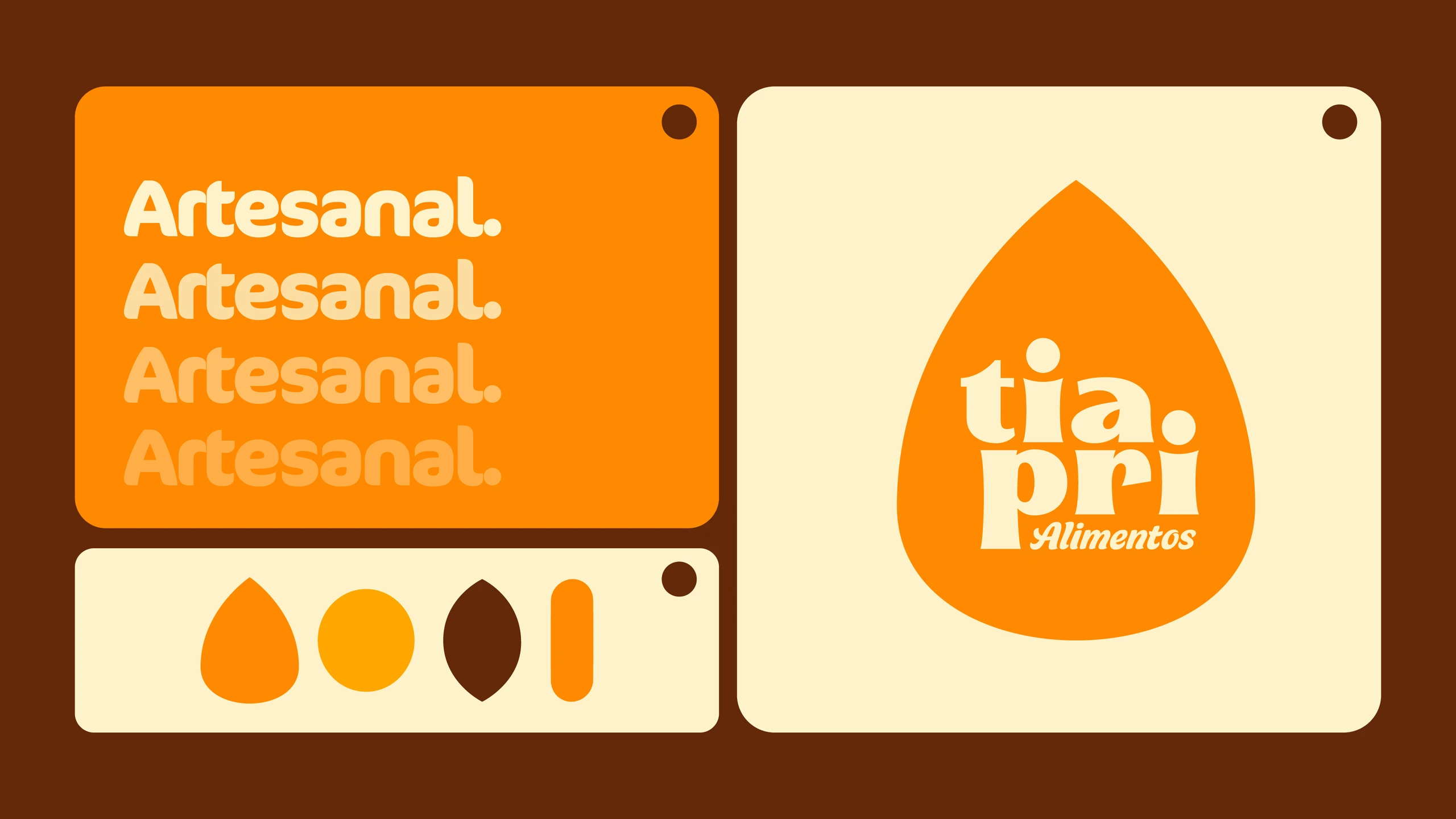
The symbol is the snack itself.
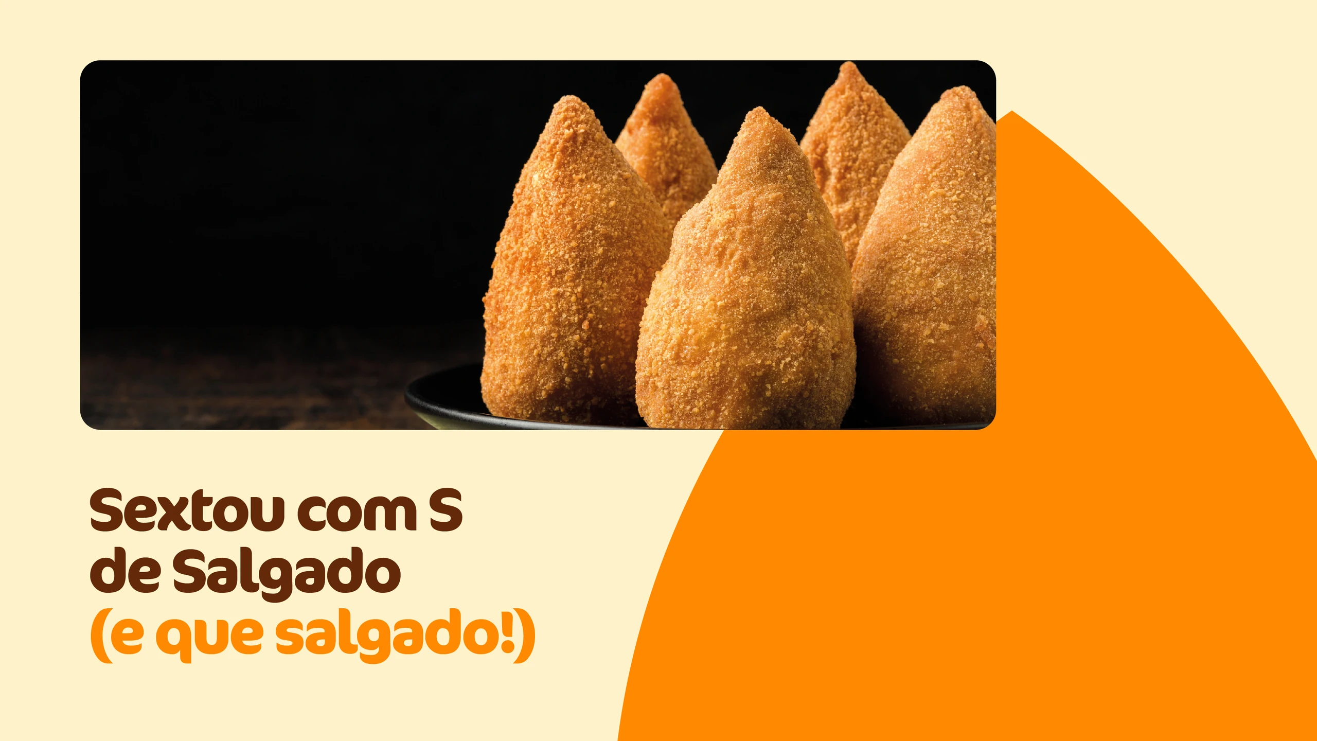
A coxinha (Brazil's beloved teardrop-shaped savory snack) becomes the badge that carries the name and taps into the warm memory of home cooking. Around it:
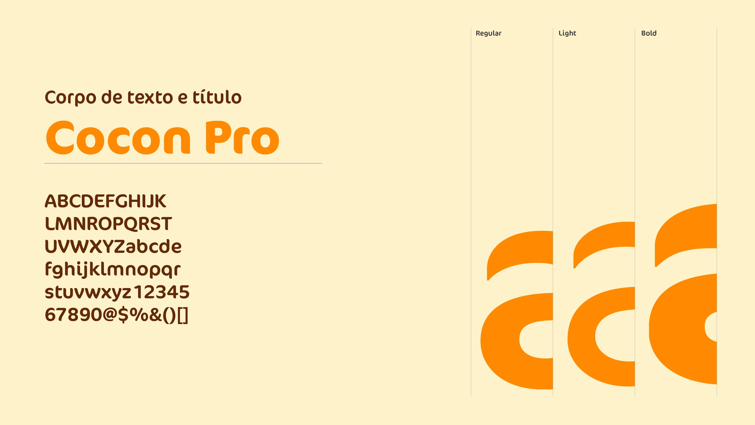
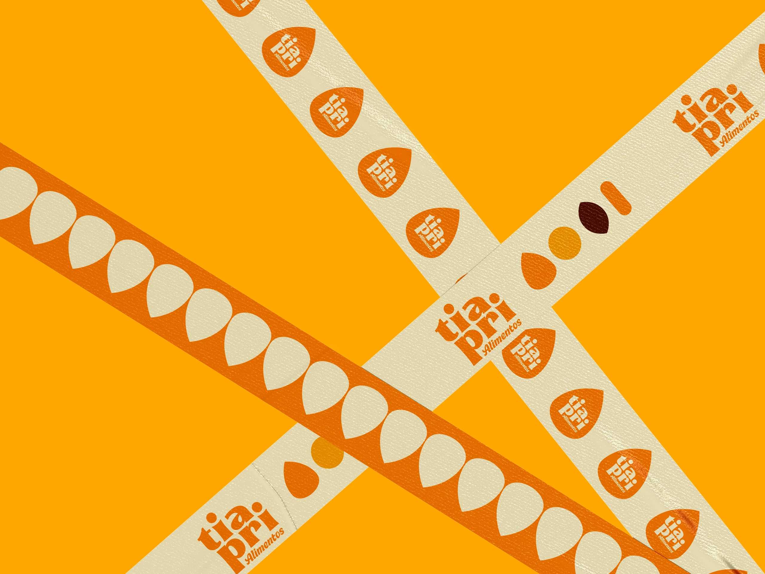
- The lettering.“tia pri” drawn bold and condensed, like a generously filled snack. Fine cuts and sharp corners add a handmade touch.
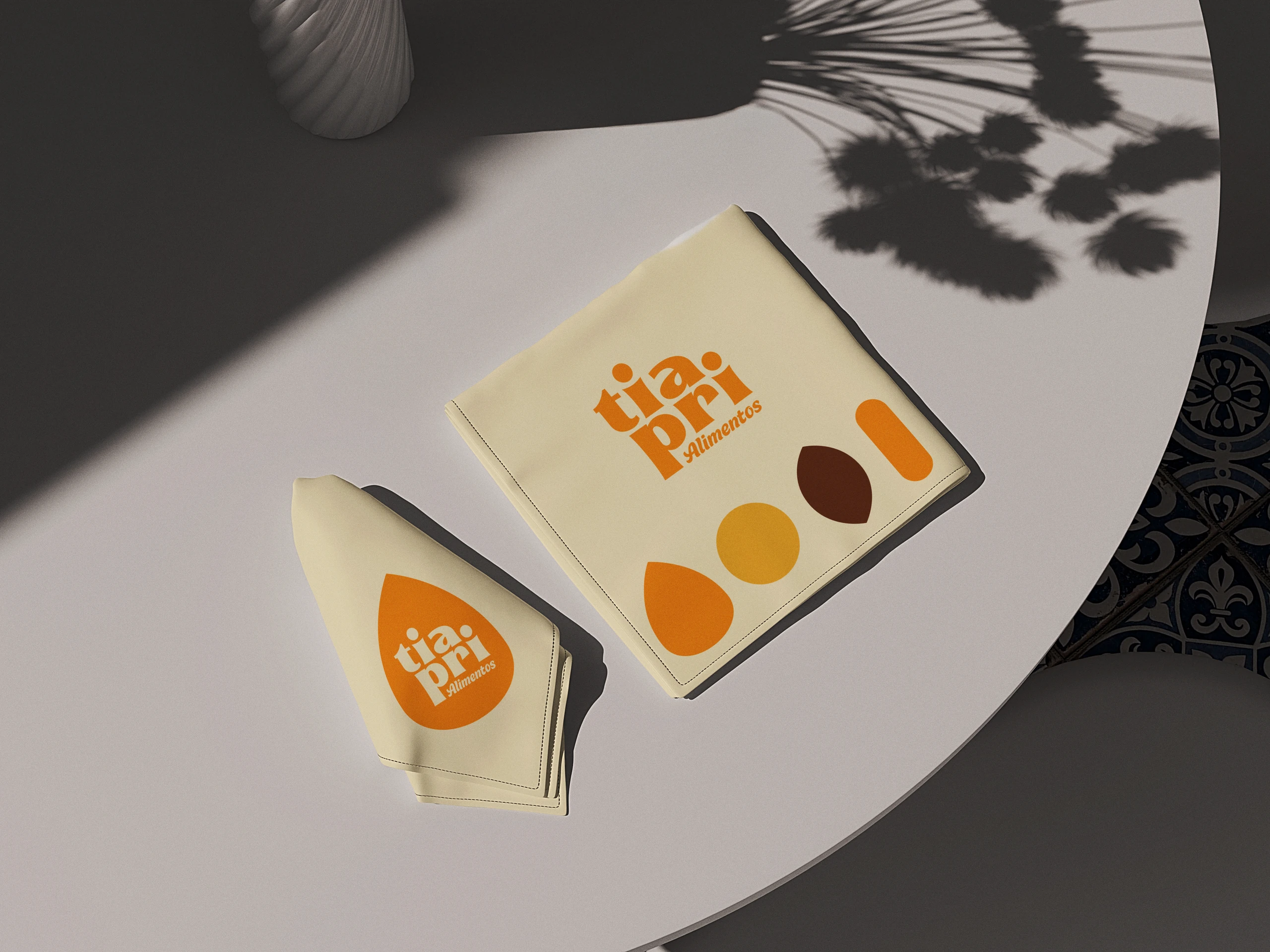
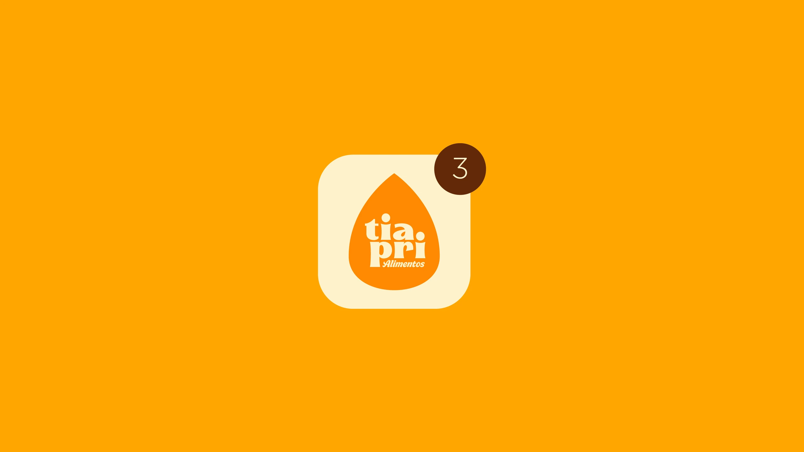
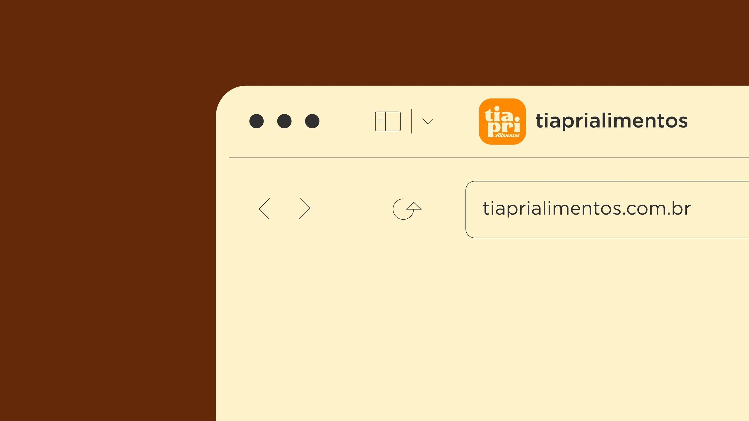
- The badge.It works whole inside a square, so it doubles as profile picture, icon and sticker without losing legibility.
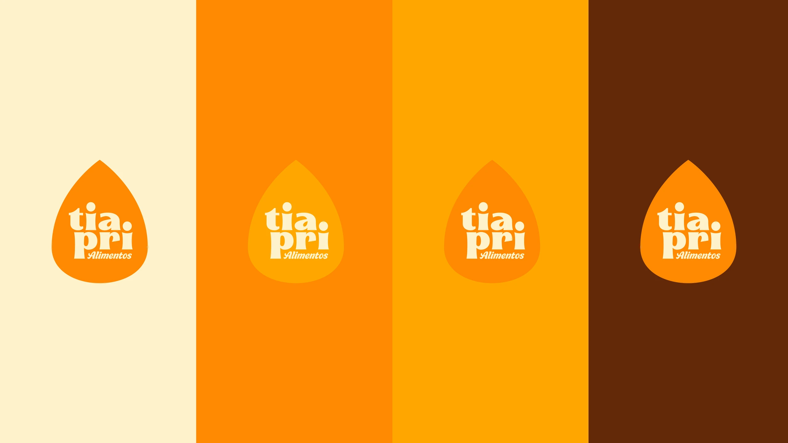
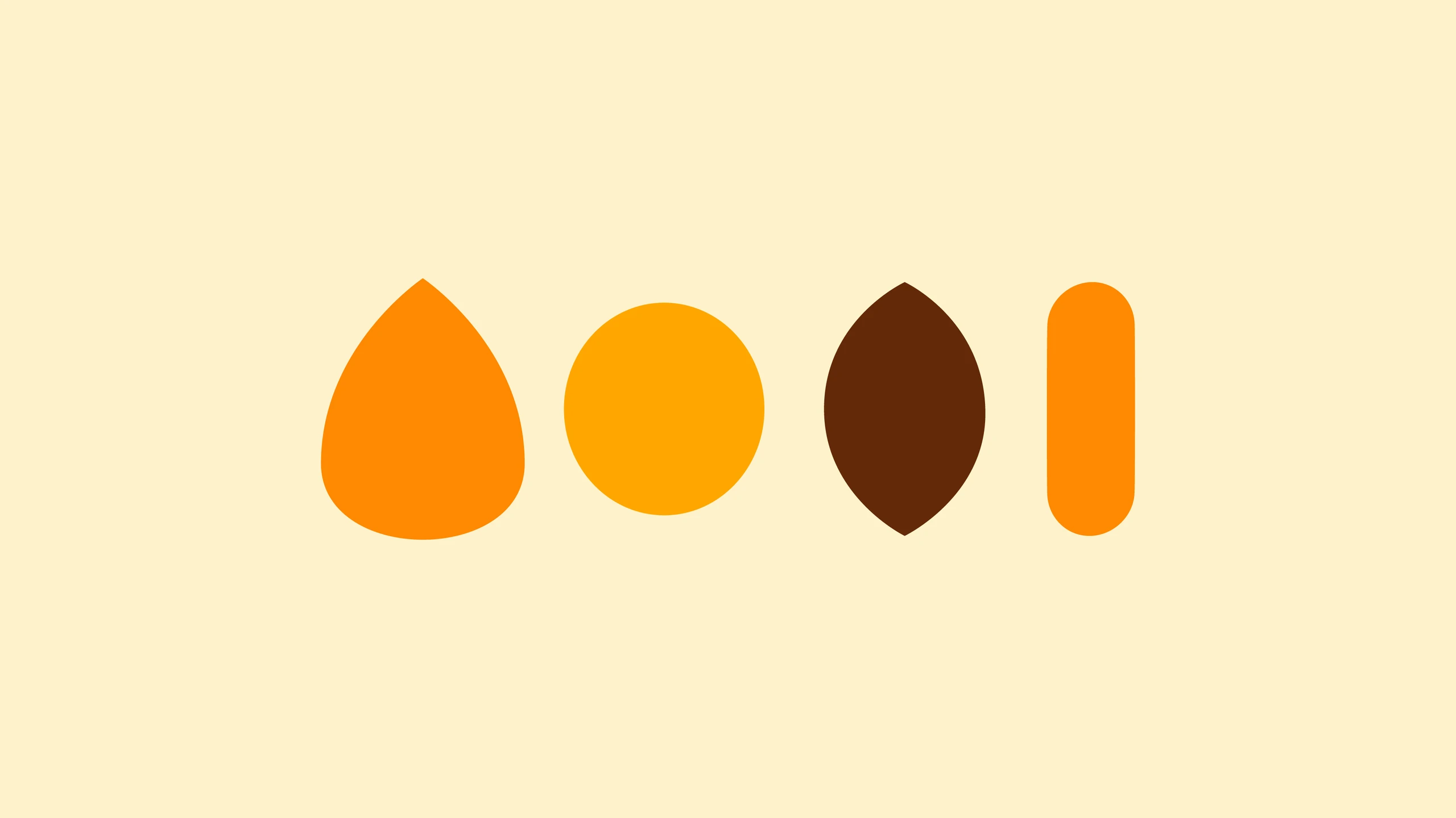
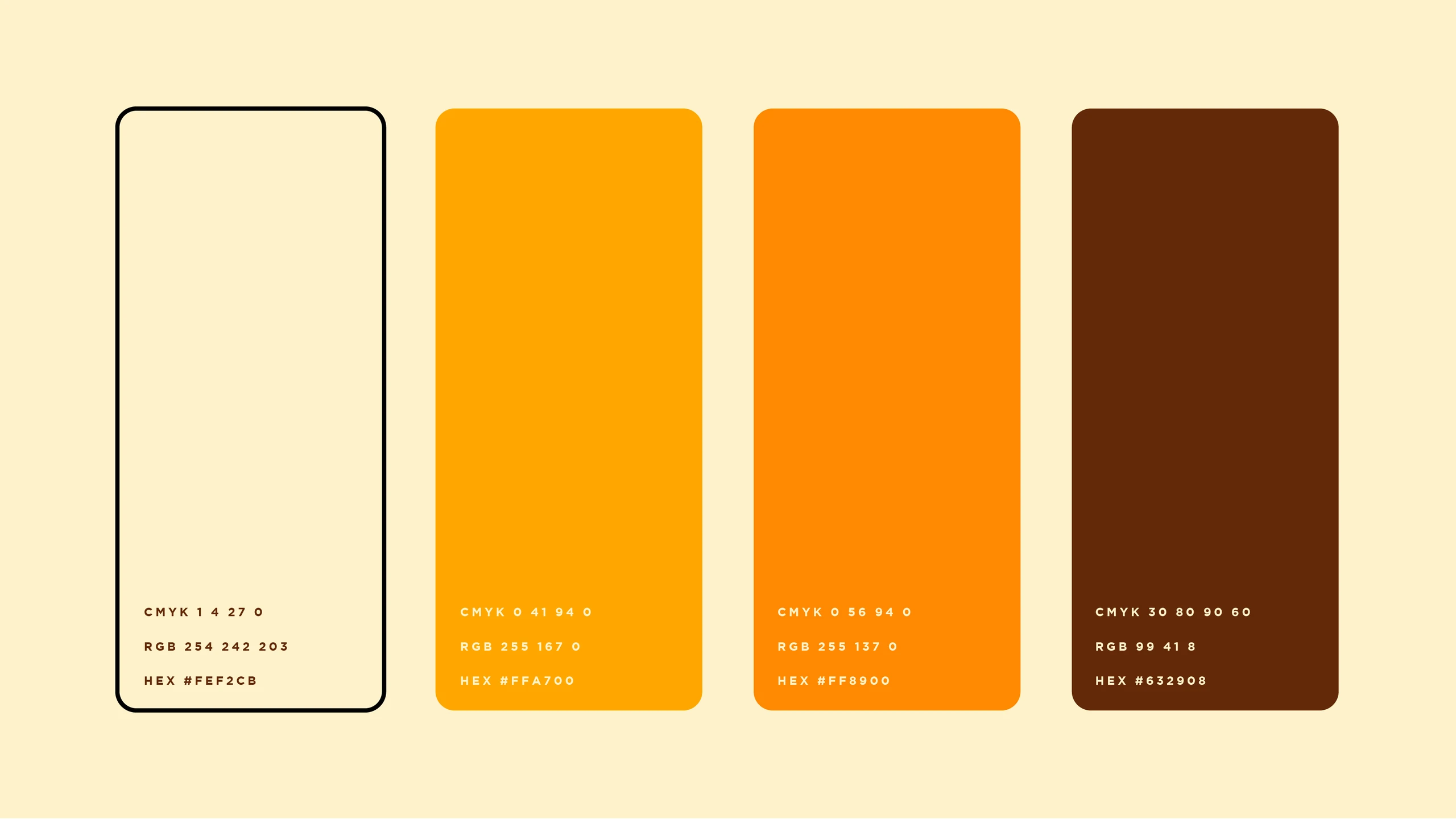
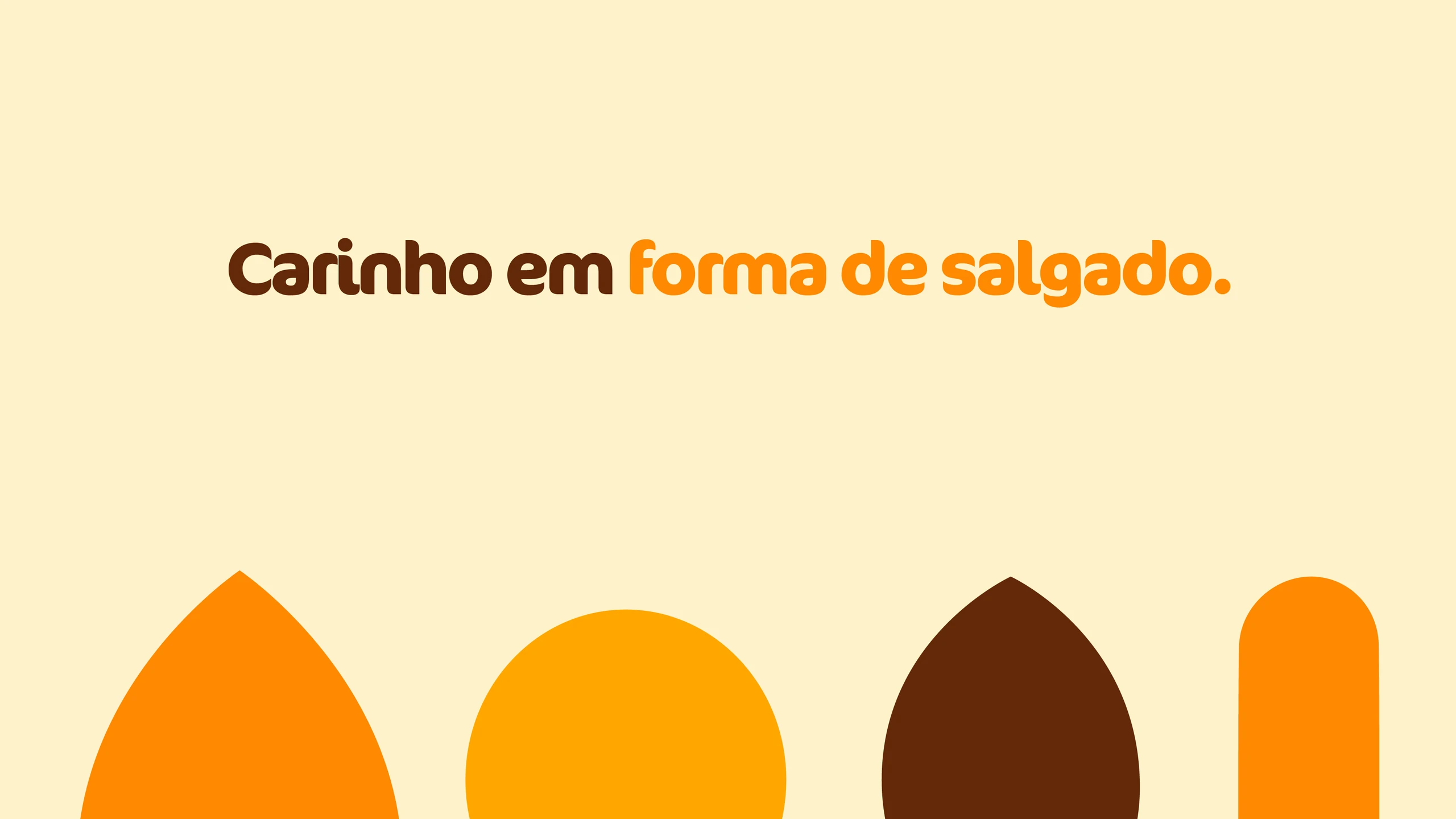
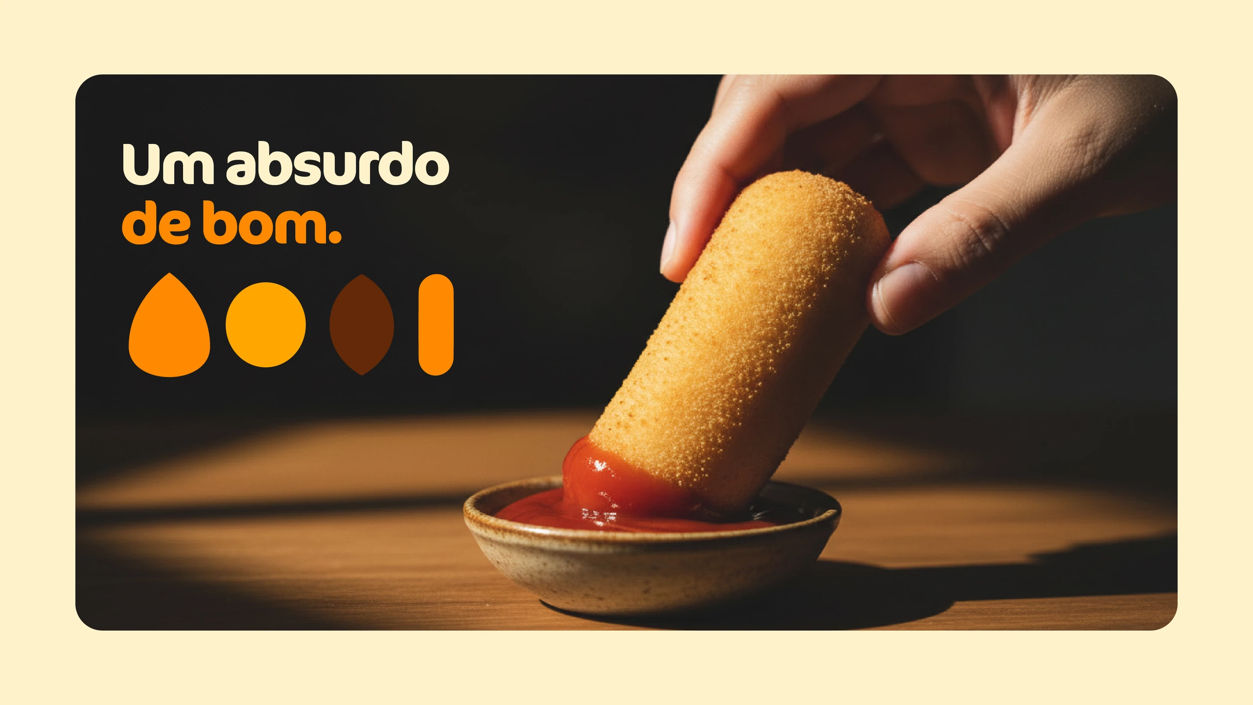
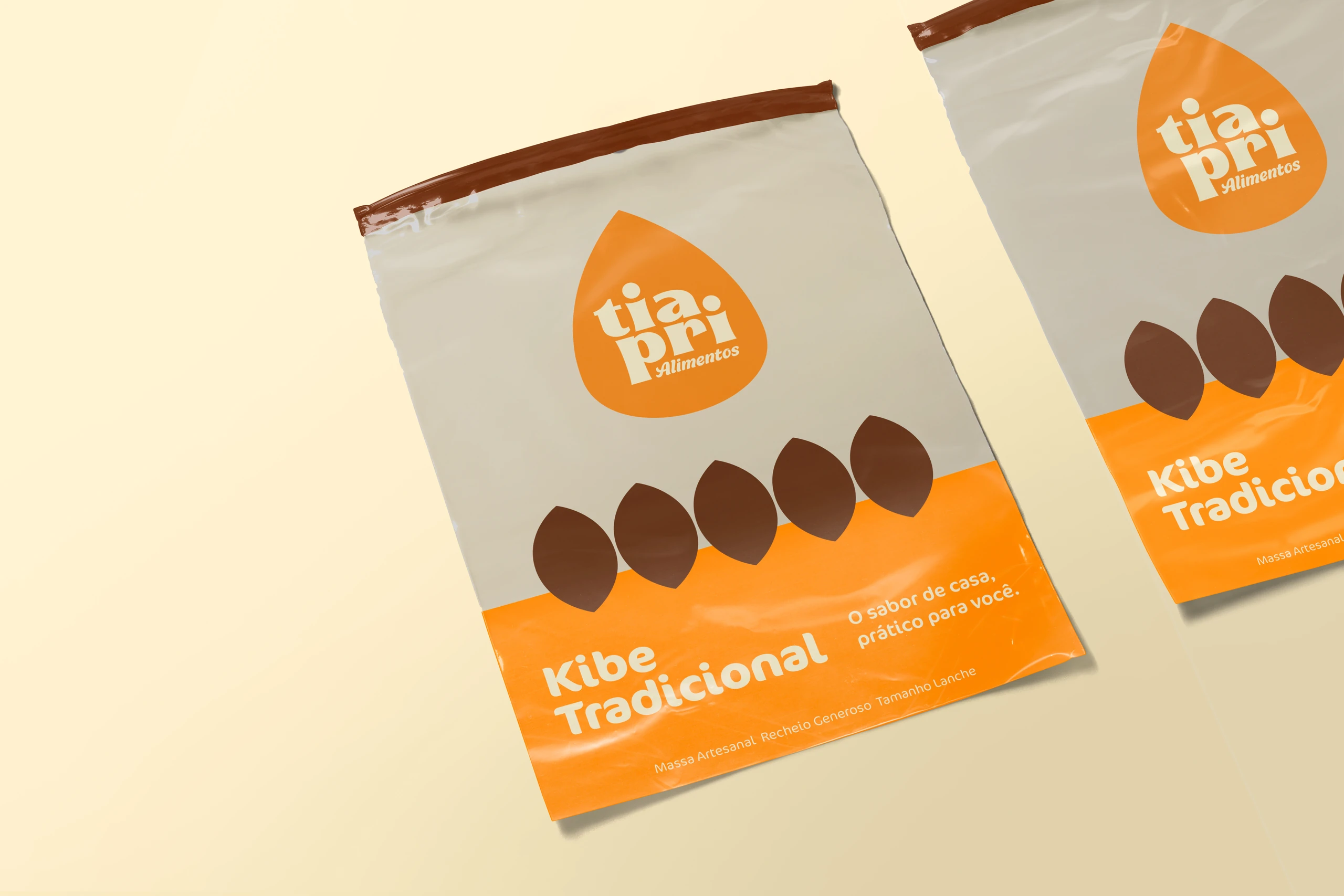
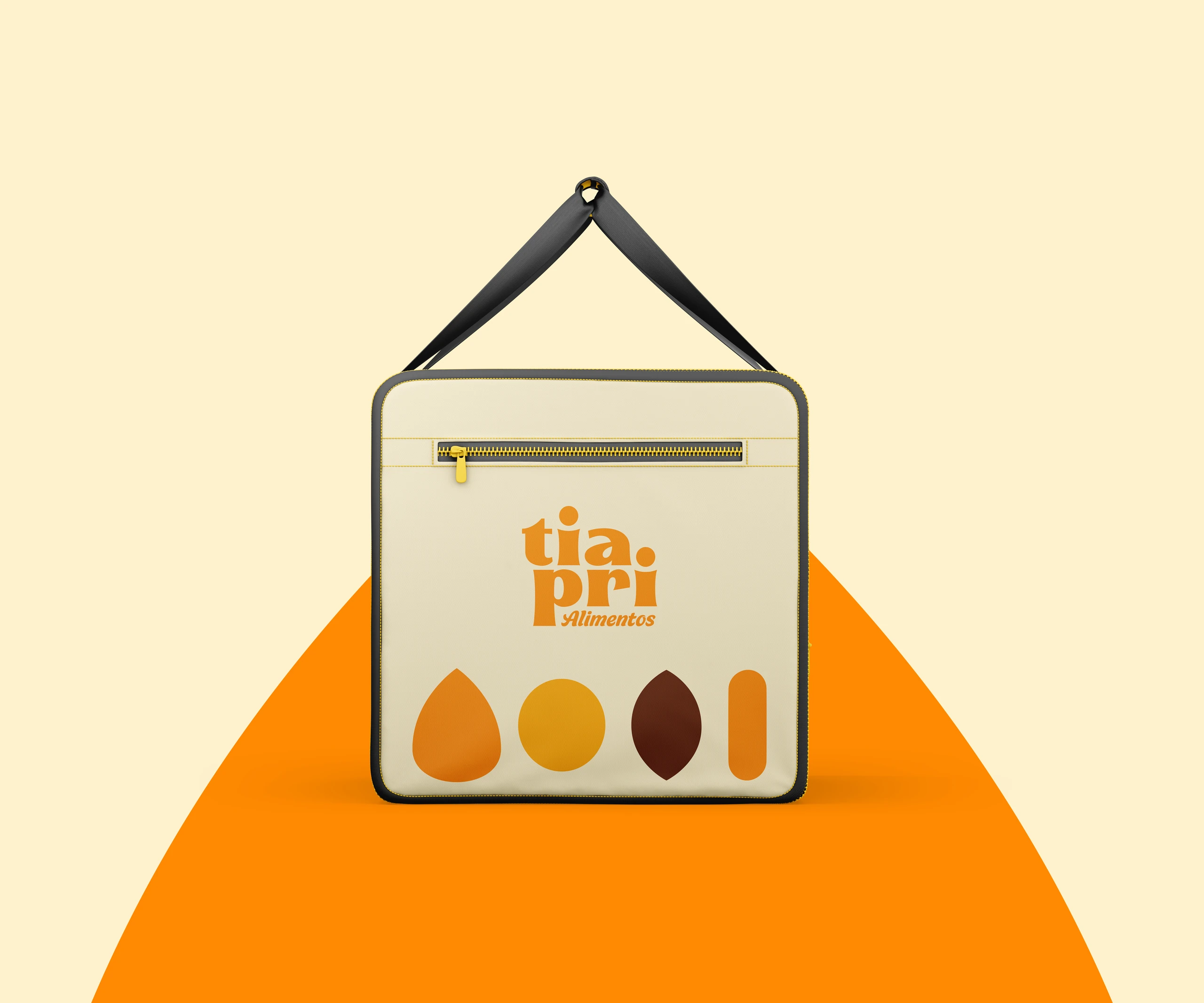
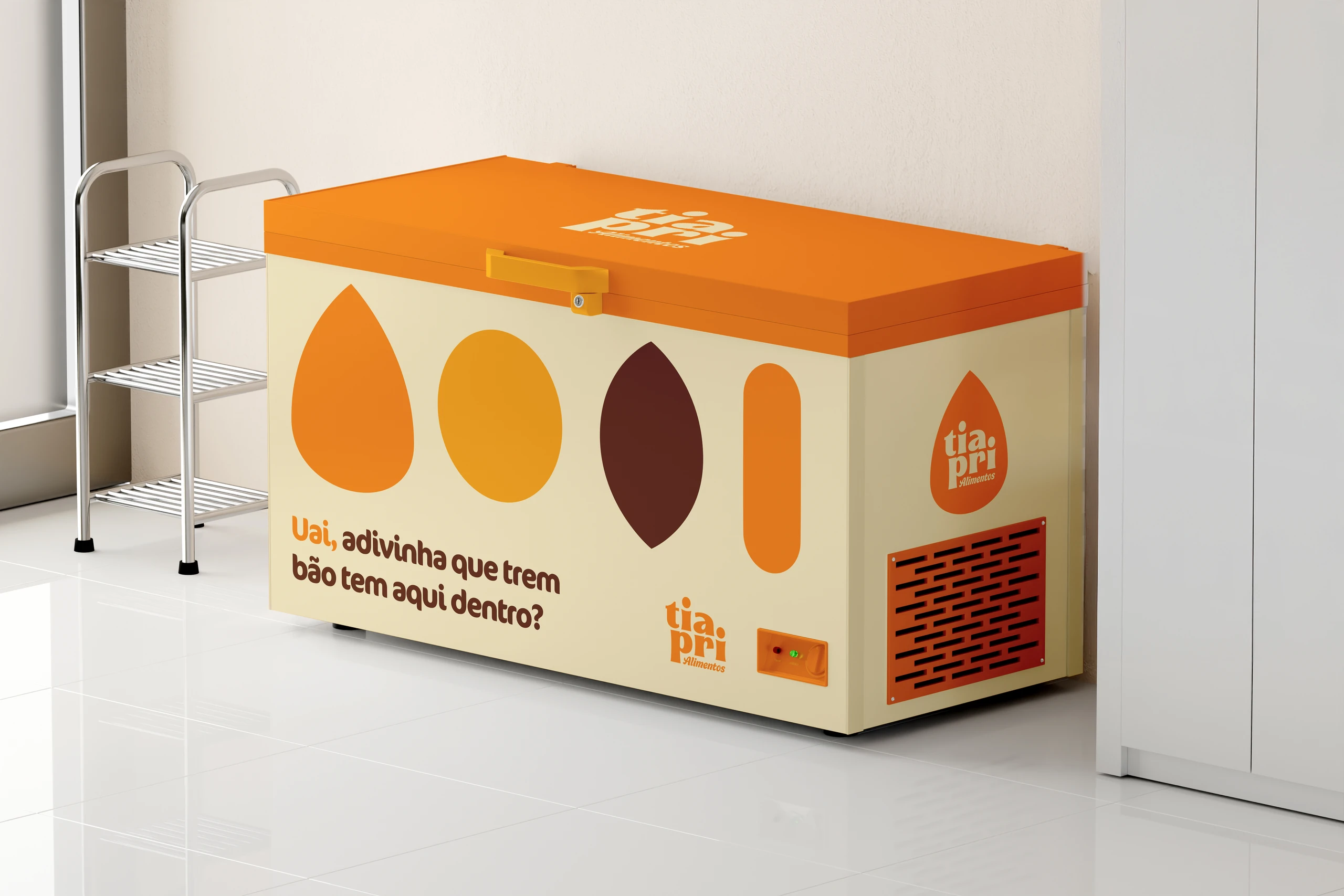
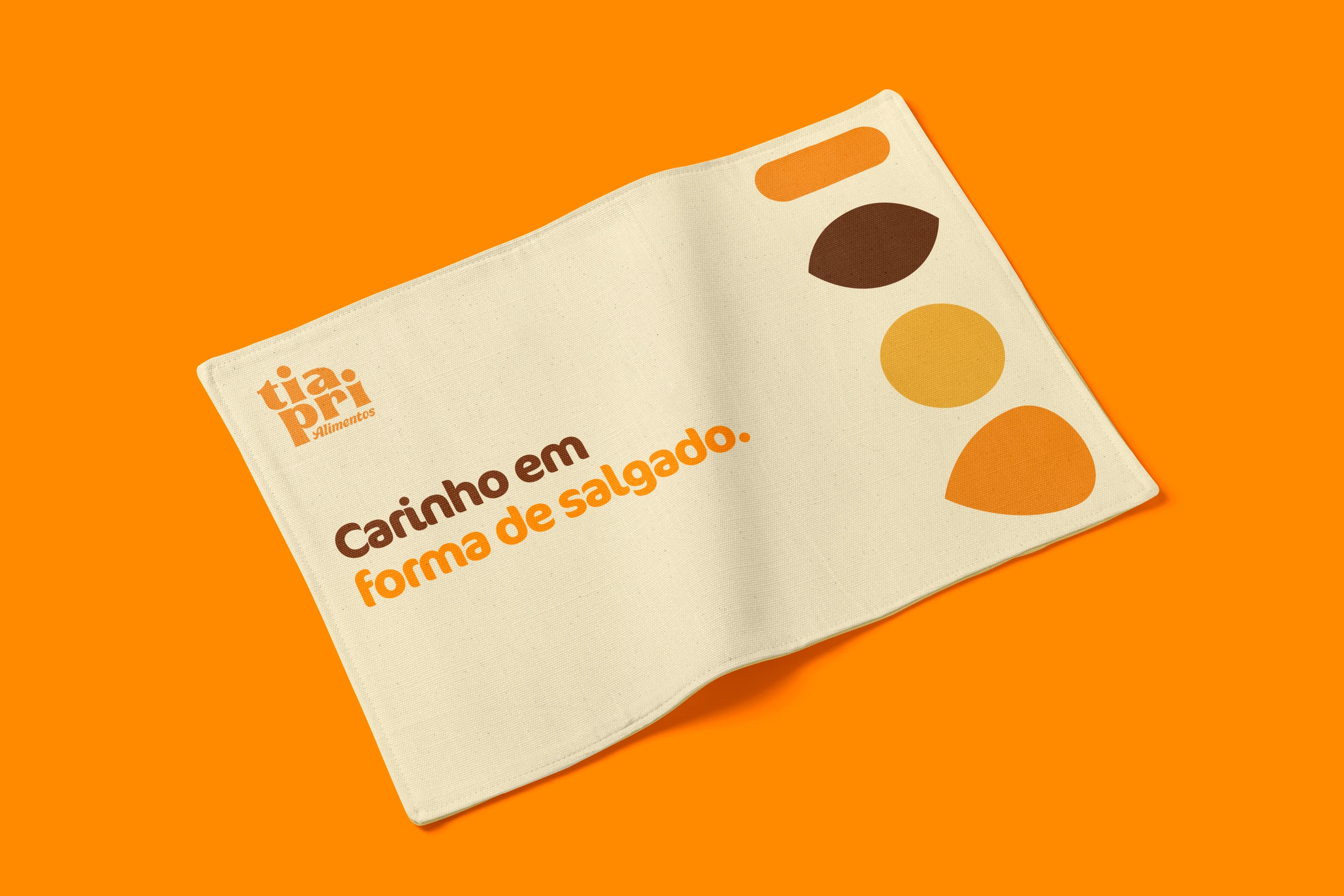
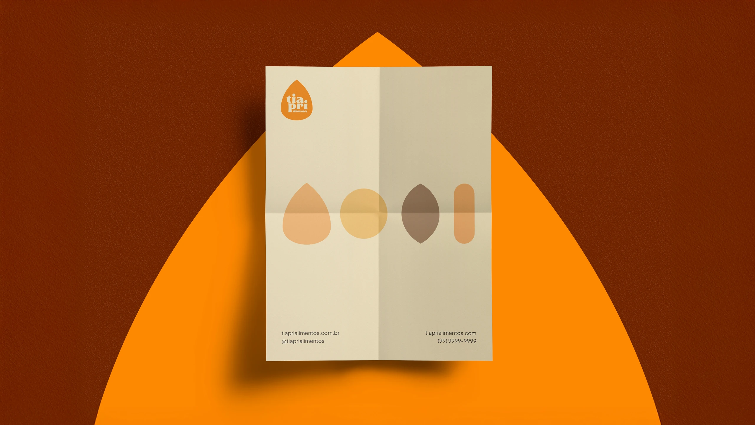
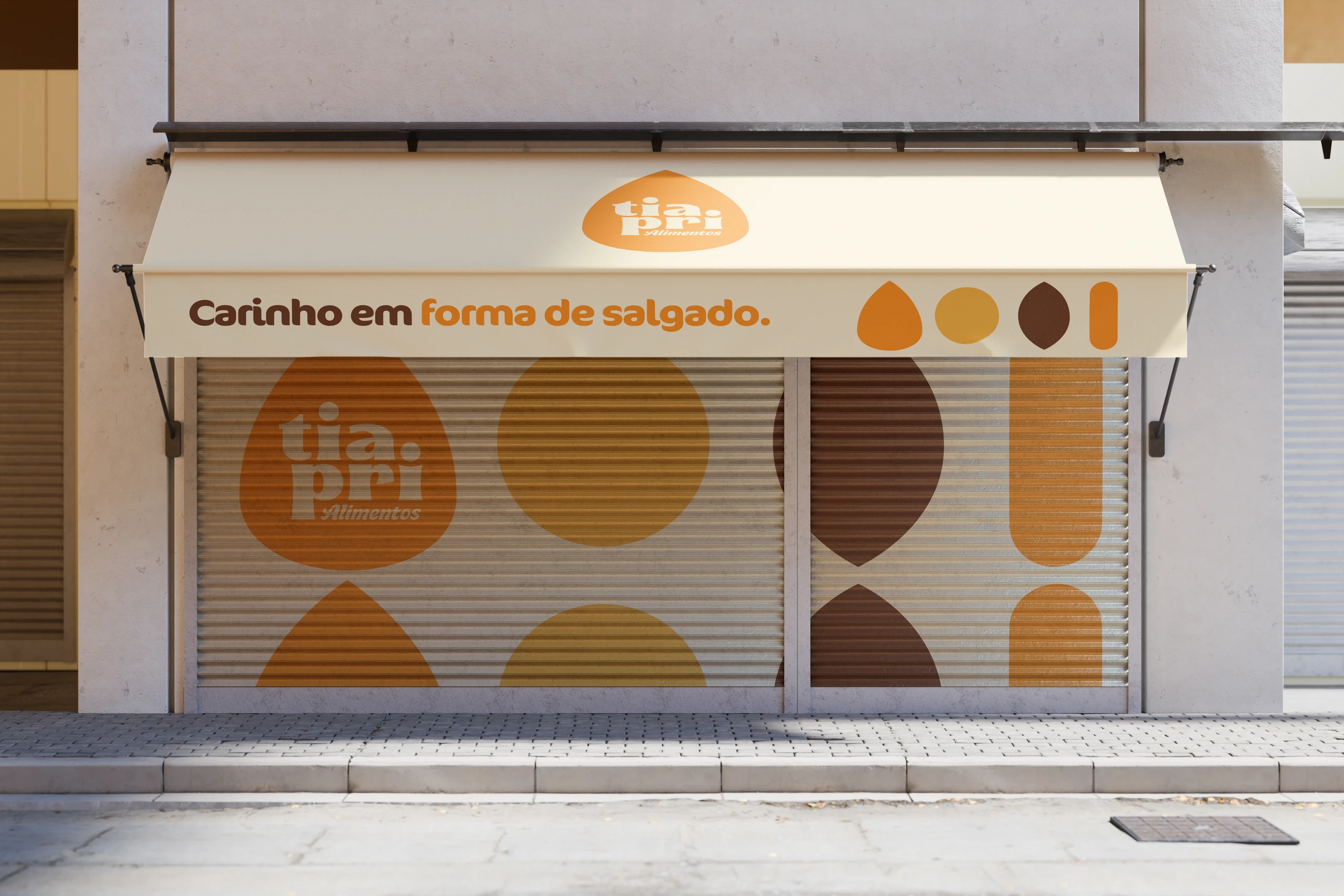
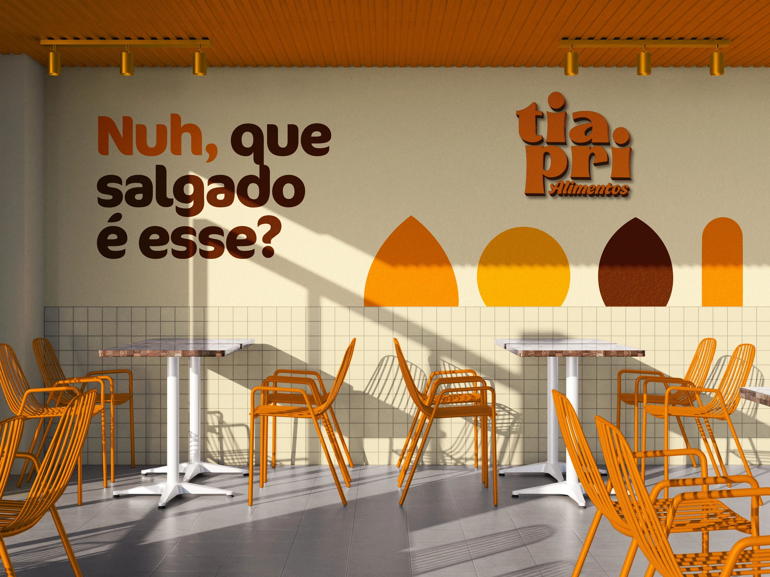
- The shapes and colors.Coxinha, kibbeh and friends become icons and illustrations. The palette runs from cream to brown, by way of orange and golden yellow.
The voice
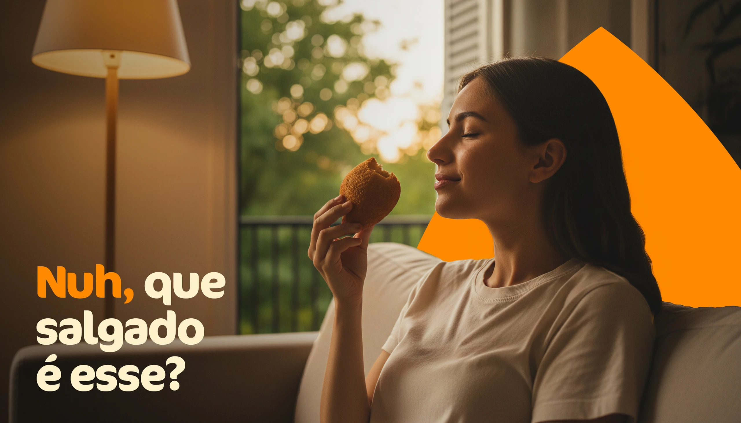
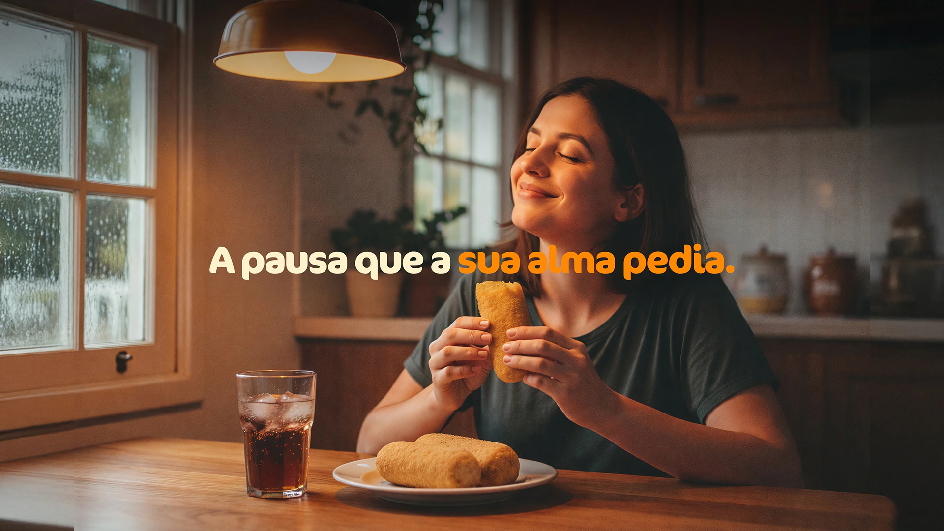
And the brand speaks like a local from Minas Gerais.
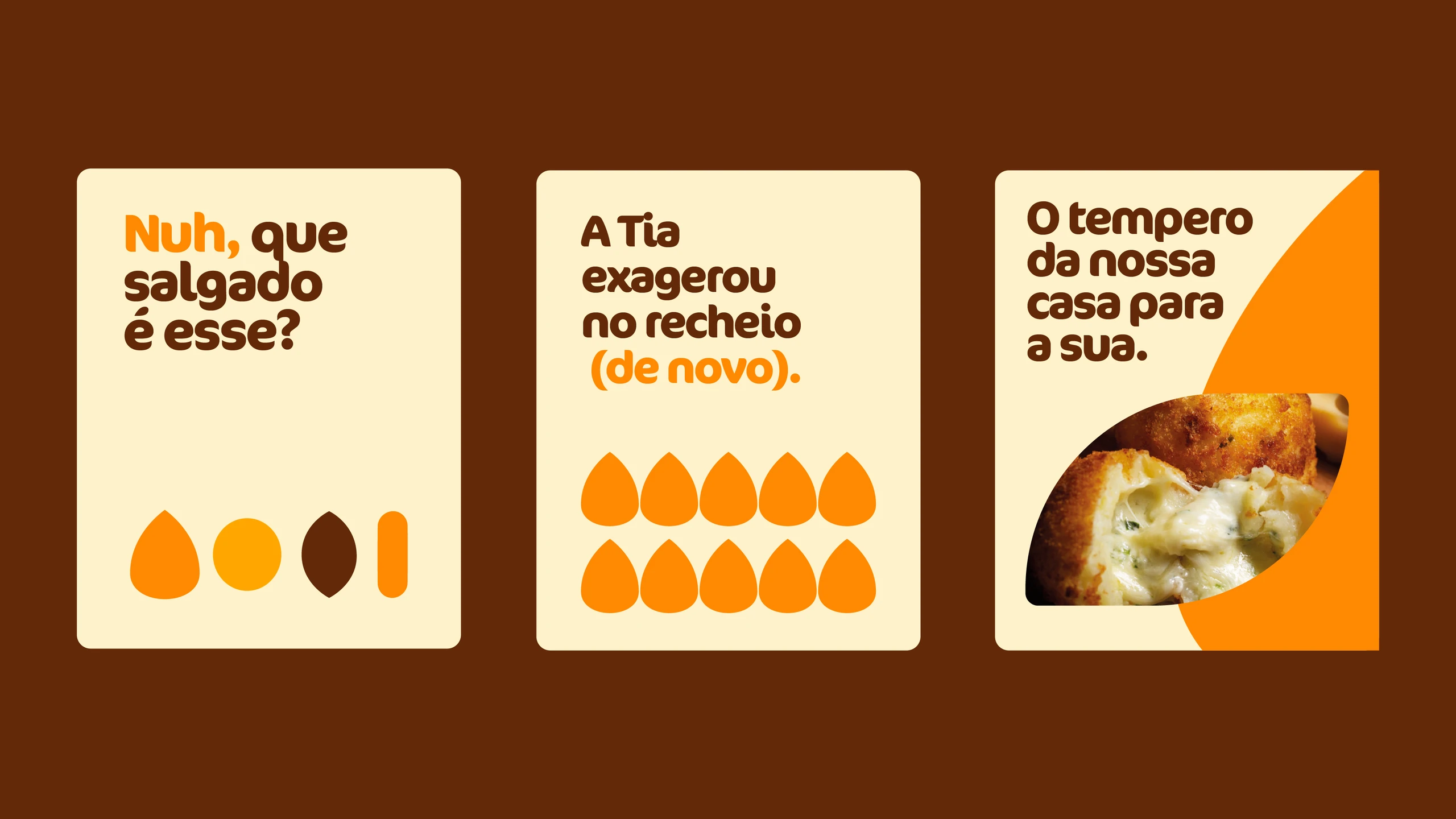
The verbal identity borrows the region's way of talking and the over-the-top generosity of someone who never skimps on the filling:
“Uai, adivinha que trem bão tem aqui dentro?” (Go on, guess what good stuff's in here?)
“A Tia exagerou no recheio (de novo).” (Auntie overdid the filling. Again.)
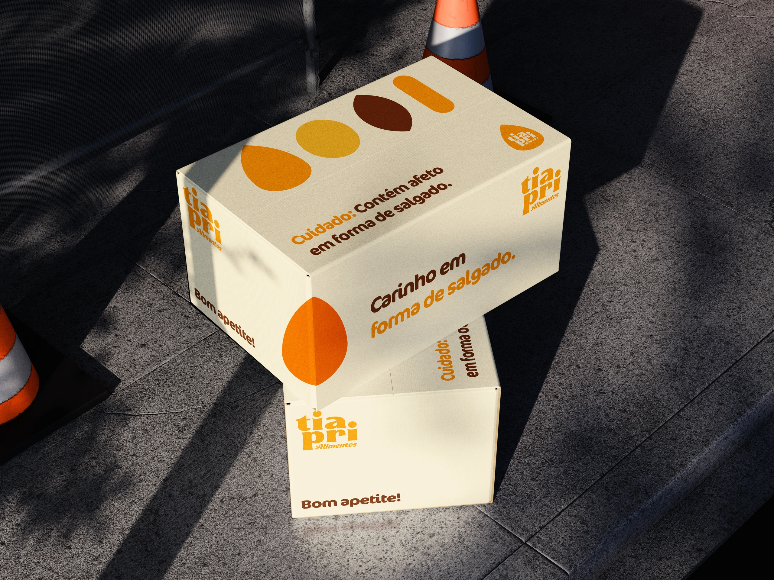
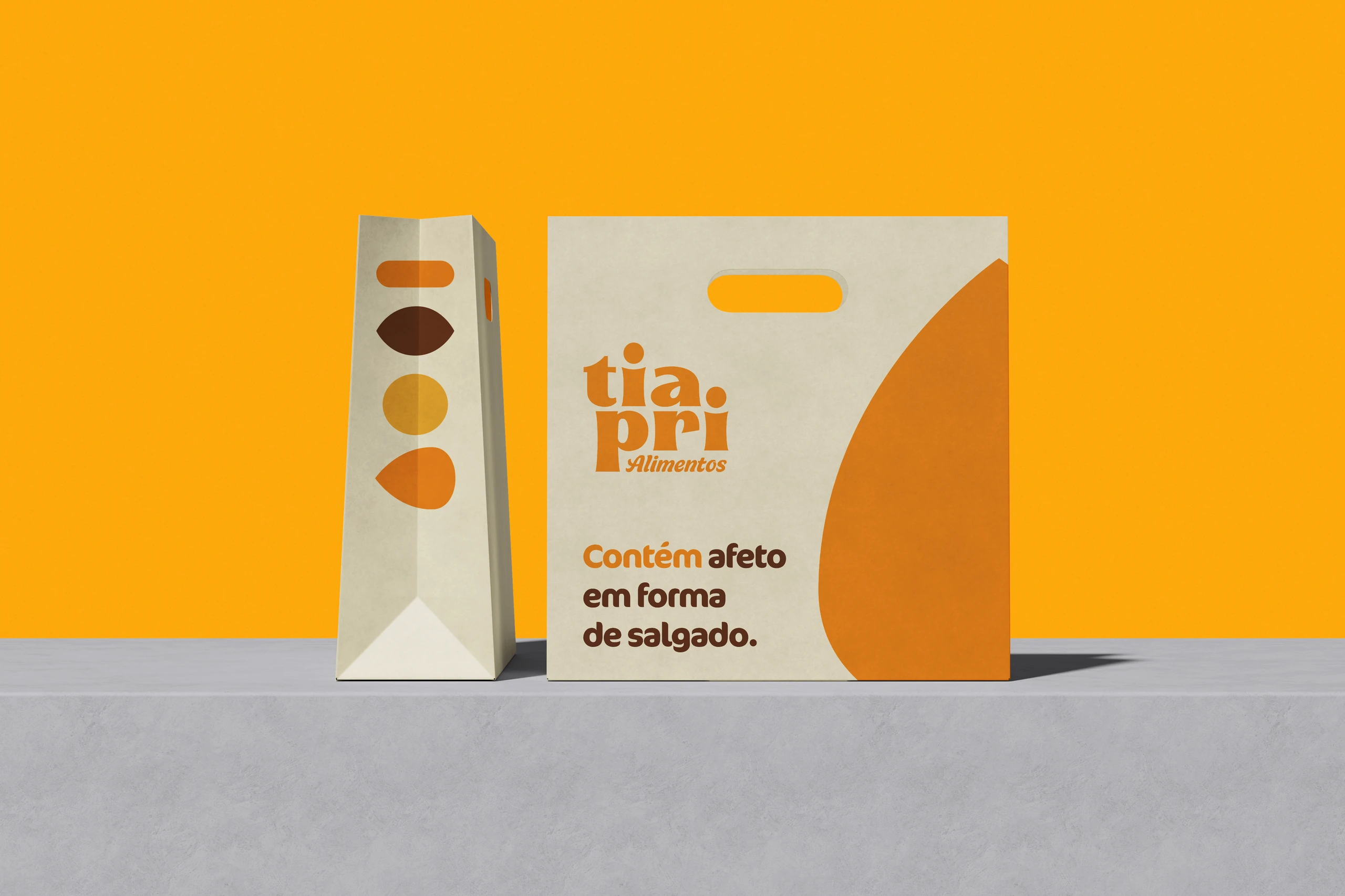
“Cuidado: contém afeto em forma de salgado.” (Warning: contains love in snack form.)
The applications
From the freezer aisle to the store.
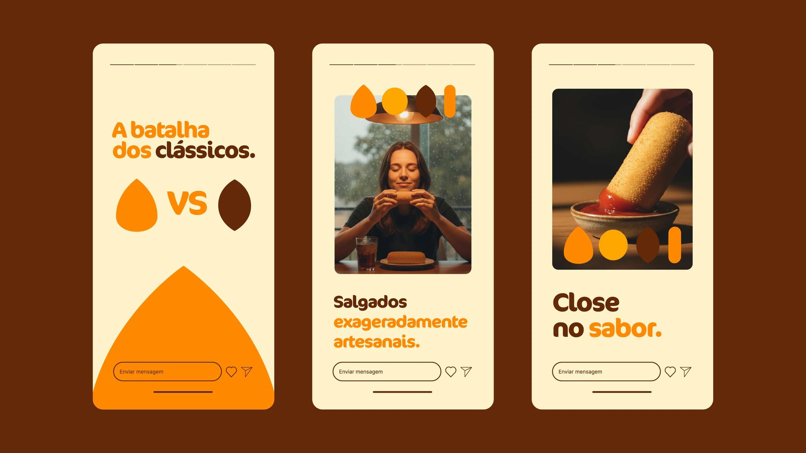
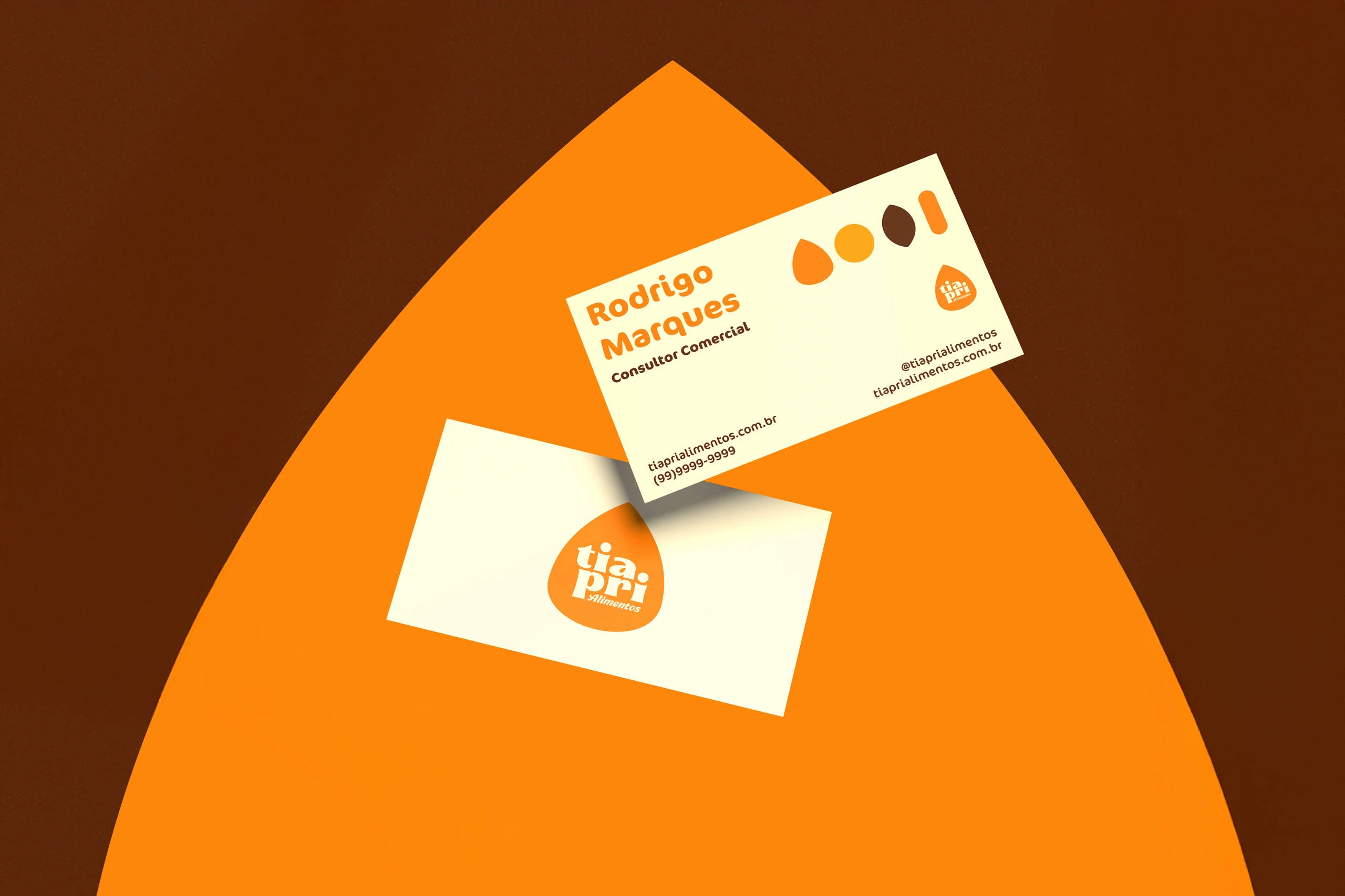
The project designed packaging and boxes for the frozen line, shopping bags, a delivery bag, stickers, a wrapped freezer, napkins, stationery, social media, and the store's facade and interior.
Is your product already good, but still without a face of its own?
 Next projectDMV
Shall we take
a look at
your brand?
The review is a free online conversation. We'll get in touch within 1 business day.